Twinings: Gets You Back To You – Behind The Scenes
Advertising can be described as a violation of our freedom. It is impolitely forced on us anywhere that there’s space to fit it. It is a necessary evil for newspapers, magazines, websites, radio and television. Hardly a wall stays up long enough to cast a shadow before a poster is place on it. Let’s face it, there’s nothing we can do to stop it. But every now and then a company and design agency join forces and make something that rewards drawing your attention.
I was watching something awful on TV, so much so I couldn’t even tell you what it was I was trying to stay awake through, but just as I thought that it was a complete waste of my time… the adverts interrupted me with this.
http://youtu.be/LdkcsDueSMM?hd=1
Once you get to the end of the commercial and realise that it’s for Twinings it’s hard not to be impressed. Over the last few years Twinings has embraced some extremely innovative advertising campaigns. The artwork of Ilana Yahav and the infused tea adverts made Twinings a brand that supports great creativity amongst the arts industry.
Skwigly was fortunate to be able to steal some time from Psyop the creative team behind the animation.
 How did you get the Twinings gig? Were you approached or did you pitch for it?
Psyop is represented by Smuggler London. Smuggler London has enjoyed a great relationship with AMV BBDO. Through Smuggler, Psyop was approached to pitch on the project. Yvonne, Si and Di happened to be in LA on another project, and we had the ability to meet with them in person and discuss the project prior to pitching on the job. It is always nice to have in person creative meetings than having to do conference calls!
Some of the most experienced animator’s I know have debated over how this was animated. My bet is it is a specially treated 3d animation. Did I win?
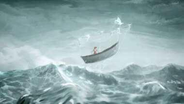
Everything was animated in 3D, in Maya, with the exception of some of the splashing water effects, which were done by some talented 2D Flash animators. The look comes from a combination of playing it back at a lower frame rate, and the render/composite style that was achieved to give it that painterly look. You win!
I don’t recall seeing this particular style or treatment before, especially for a commercial. What process did you use to animate it?
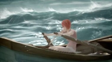
To elaborate on the style and treatment outside of the animation, the actual process to achieve the look was quite a task. Basically everything was rendered in the same fashion as any 3D project. The tricky part was taking those renders and making them look as though they were hand painted. To achieve this we used a combination of Photoshop and AE filters. There was a lot of layering that needed to be done to build the final look. At times we had to go back and render passes that seemed unorthodox. There were spec and diffuse passes that were blatantly generated to be “wrong”, but when filtered they achieved the exact quality needed for the filters to grab onto. It was odd asking our lighters to make passes that didn’t fit the standard practices, however when we found the right technique it was very obvious that these additional layers would eventually gel and enhance the post filters being applied. On top of all of this, we had two traditional 2D artists go over top of our imagery and produce some more free flowing and stylistic effects that really enhanced the spots as a whole. We even had the designers and art directors chipping in to smudge edges frame by frame just to loosen up the sharpness of the 3D renders. The combination of all these elements and filters was quite painful from a production standpoint, but in the end it really makes the spots visually pleasing and stand out in multiple facets. Hand painted animation is very technical and unforgiving, so looking at the tedious work of our team, there was a lot of that same love and care given to each frame in the same sense a traditional artist would. It was amazing to see it all come together to what we believe is a very beautiful and unique end product.
How long did it take to produce from conception to completion?
The project took approximately 4 months (there are 2 spots).
 Has this been a technique that you have been working towards or is it one that you experimented with just for this project?
As far as I know this technique hasn’t been tried before here at Psyop. It’s supposed to mimic a more traditional media in terms of the animation, although it’s more of a trick than an actual stab at animating the whole thing frame by frame, or “on 2s”. Our inspiration for the motion came from 2D animated oil paintings. We tried to achieve a similar look by cheating the frame rate instead of actually sitting and keying every frame by hand.
3D animation in Maya is a bit more forgiving than 2D, when animation comments come rolling in from the agency/clients, so we stuck with animating at the standard 24 FPS, and then output the spot at a lower frame rate to achieve a similar look to what we were going for. It’s not a spot-on match to a traditionally animated piece, but the lower frame rate gives a look that is close enough, given the restrictions we were working with.
It really was one of those moments that we had to step back, look at it and just experiment. I’d say we had a spell of about three weeks where all we did was build a foundation to move forward. There was a definitive idea of how we could achieve the “painterly” effect, but as we all know ideas are just that, “ideas”, until you have to actually apply them. The first few times we ran tests, we would like certain parts of the effect, but then there were those little areas here and there that really lacked the feeling to tie it all together. While it wasn’t a “back to the drawing board” moment each time, we did find ourselves tinkering a lot in the initial first runs. It would be safe to say it was a very organic process. Try something, learn, throw it away and try again. It’s really a true art in itself and looking at any type of art, this project was on par in the sense of art as a process.
 What inspired the style of the piece? Whilst I don’t think I’ve seen it before it feels very familiar?
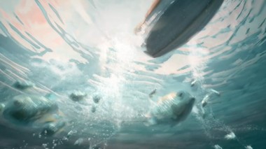
The style of the animation was inspired by a range of traditional paintings of artists and illustrators. The looseness of brush strokes with hard and soft edges were some of the painting principles that we pushed to bring into the animation. Many of the initial concept art created for 3D films are amazing paintings in itself, and for this project, to see the final animation reference the initial design frame to the detail of the brush stroke was a unique and great experience for us.
Anything else in the pipe-line to do for Twinings or was this a one off?
We will leave this one to the agency! We hope there will be more …
It’s easily the most powerful animation of the year. Will it be put in for any awards?
Yes!
After the enormous reception the animation received, have you considered working on a project for the entertainment industry?
We are always flirting with the entertainment industry since our work on Happiness Factory. However, we are looking for the right project to be our first foray into that world.


