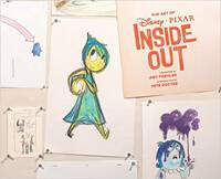
The Art of Pixar’s Inside Out – Review
Pixar’s latest smash hit, Inside Out is delighting audiences throughout the world with what has been described as a true cinematic return to form. Pete Docter, the director behind Pixar classics such as Monsters Inc. and UP has delivered another high concept film that doesn’t hold back on action, adventure and, rather appropriately, emotion.
The film is a rich tapestry of ideas and takes viewers into a unique world of adventure, fun and intrigue, all of it crafted by Pixar’s finest and so if you could borrow the films concept and peer into the head of the film to see how it operates, your first port of call would be the Art of book.
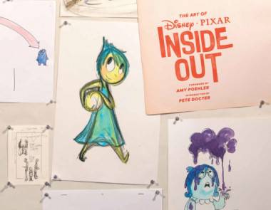
Traditionally the Pixar art of books have always been the standard bearers in the field of colourful coffee table books. It doesn’t matter if the film is a bit lacklustre, as the art of book will always faithfully showcase the original thinking and design sensibilities of the film. Cars 2 is a great example of this, a mediocre film but a fascinating book providing a riot of colour and a journey into the world that the film took for granted and didn’t really explore, highlighting the best bits of the film. Unfortunately it seems to be the other way around with this book, a fascinating film but a mediocre book. That’s not to say that the artwork in the book isn’t impressive, just that the book itself feels more like a cash in than the usual introspection of the film. This is mainly down to the fact that there is no author. The book has a forward from “Joy” herself Amy Poehler and a introduction from director Pete Docter, but without an author to outline the film making process this book flounders. There is a distinct lack a guidance throughout this book, and although it is easy to feel your way through the images and recognise the direction the production process would have taken, as a reader, I would have still have enjoyed more than just a “look” at the making of the film.
The standard of artwork is terrific, as you may expect, but the layout of the book doesn’t do justice to artwork. The images are just displayed with very little visible thought to any creative design work that would have lifted the images from the page, this is usually fine in say, a museum catalogue, but in this art of book it feels like viewing a badly arranged portfolio where the wonderful artwork sadly suffocated through indifferent presentation.
On the plus side, invested fans of the book will appreciate and enjoy the variations on character designs, story ideas and production materials that this book is crammed full off, and for those folk I recommend this book. However this book ultimately is an example of the dire need that these tomes have for good authors and for good layout designers. I hope future books keep this in mind and bring more Joy to readers, rather than Sadness.
Items mentioned in this article:


