Interview with ‘Inside No. 9’ Animation Director Sam O’Leary
Inside No. 9, the multi-BAFTA-winning comedy/horror anthology series, finished its seventh season with Wise Owl, a truly dark tale that pays homage to the infamous, nightmarish 70s public information films created to warn children of various dangers. Co-starring and written by League of Gentlemen alum Reece Shearsmith (A Field in England, Under the Earth) and Steve Pemberton (Benidorm, Killing Eve), the anthology brings together an eclectic range of themes, genres, and subjects into a must-watch show that enjoys a broad and loyal fanbase. As a big fan myself I had wondered when the show might dip its toes into animated waters, as the duo behind it are no stranger to the animated medium through previous projects The League of Gentlemen’s Apocalypse making use of stop-motion puppet animation, as well as Reece Shearsmith’s performance in Ashely Thorp’s animated documentary Borley Rectory. Wise Owl brings together themes that are true to the series as well as the source material its referencing. Blink Industries Director and Animator Sam O’Leary was an ideal match to create the episode’s animated segments, his previous work straddling the line between humourous and truly horrific, brought to life in a purposefully lo-fi cut-out style and innocent but malevolent visual design. Following the episode’s broadcast last week, we spoke to Sam regarding all things Inside No. 9.
Did the opportunity come in to Blink first, and then you pitched on it? Or was it brought to you directly?
I’ve always loved Blink Industries; I love everything they make because they really push the medium and are willing to experiment. I sent them an email around two years ago, just saying that I really love their work and here was the work I did. Then I had a Zoom meeting with them, which was really nice. They said that if I wanted to send in anything else for them to look at, maybe we can make something together. A year went by and then James from Blink called me to ask if I’d be interested in animating an episode of Inside No. 9! It came out of nowhere. I was in a park somewhere when I got that phone call, and I had to lean against a tree because I felt like I was going to have a heart attack. Then that day, he sent the script over, then we developed a treatment, I actually made some animations based on the script because I didn’t want to let this opportunity slip by. I made three little fully animated clips with voices – that I got my girlfriend to do, pretending to be a little boy. We sent them all over and a week later I just found out I had the job. That was about eleven months ago now, it’s been agony waiting to tell people about it.
Did you get to meet and discuss the project with Reece Shearsmith and Steve Pemberton personally and what did they ask for specifically?
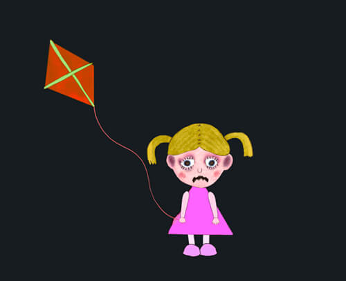
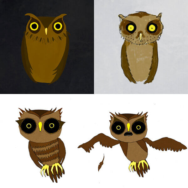
Yeah, it was really collaborative. We had a lot of Zoom meetings, they knew they wanted it to be like Charlie Says, and all these creepy PSAs and I watched loads of them beforehand so already knew what their references were. The only real thing there was a lot of back and forth about was the character designs, because at first they looked a little too modern. I gave the boy spiky hair and he looked like a kid from maybe like 10 years ago. So, I just kept making the hair longer and longer. It became proper 70s and then they were like “That’s it” and signed off on it. They just wanted it to feel authentic and that was my main focus for the whole thing, making it look authentic and ageing it and kind of ruining it most of the time. With the software I use people want everything to be really nice and smooth, so I had to keep breaking things apart and putting in little mistakes.

Early character design (image courtesy of Sam O’Leary)
What other research did you do, and how did you combine that into the animation process and visual look of the segments?
Well, I couldn’t actually find that much on how they were made – Charlie Says, for example. I knew that most things back then were cut-out cels and that kind of thing. I knew we couldn’t do that because one, it was time-consuming and two, we then couldn’t change anything, which ended up happening; lots of things were changing as we were going. Honestly, it was mainly visual and instincts. I didn’t know exactly how they did it, I just tried as best as I could to replicate it. Almost all the characters were designed in Procreate, as there are so many good tools that look hand-drawn. I would maybe overlay a paper or paint texture. I made many different versions of each head and the arms etc, then I would just reel through them so it would twitch authentically and look like someone was moving something. Like with The Lego Movie where it’s not stop motion, but they wanted the plastic to look realistic, so they added fingerprints, scratches and seams and mistakes. I love that. So, I was trying to do that a little bit. I guess I was trying to get as close as possible to the originals without it taking like two years for me to make. After Effects was perfect for getting down into the very specific details, adding a twitch in the right place and making sure that it’s never too long until there’s another little ‘error’.
Your personal back catalogue of work is quite eclectic. Often straddling the line between horror and comedy, much like the work of Pemberton and Shearsmith. How do you feel animation aids in combing those two genres or themes?
I think animation is so great, because there are basically no limits to what you can do, if you want to make someone look scary, you can just make them 10 times the size of somebody, but it doesn’t break the reality too much. I love it for that reason, it’s so easy to change the tone of something in a way that you wouldn’t ever be able to do if you were filming something, it just feels very freeing. With horror and comedy, did you ever watch Monkey Dust? Because that did it perfectly. There were some sketches they did that weren’t even funny, one recurring sketch was of a man who had broken up with his wife and his son comes over every week, but the son hated coming over to his dad’s because his house is all cheap and depressing because his mum got everything. And every time the sketch ends with him, shooting himself in the head upstairs because his kid was so horrible to him. Then the sketch would just end, and it wasn’t even funny. I really liked that, I like things where there are funny moments, but it’s not a comedy.
I don’t mind admitting that I’m incredibly jealous. This is a gig that I’m sure lots of people would have loved to work on. What was the whole experience like for you?
An absolute dream come true, obviously. I’ve loved them since I was a little kid, I have quoted them my whole life, I’ve received League of Gentlemen birthday cards because I liked it so much. I honestly can’t believe it’s happened; I think up until 10pm on the night it aired, and I saw for a fact that it was on there, I just couldn’t believe it – and because I haven’t been animating for ages it was also quite nice to have that passion recognised. I think in the treatment that Blink and I made, it was so obvious that I was a fan. I was like “maybe we can even animate the hair and hide it in there, we could do subliminal messages…” I just needed to throw everything at it. So, they knew how much I cared about the show. The whole thing has just been completely unreal. Watching the episode for the first time as it was going out live was the happiest I’ve ever been. It was crazy. A friend of mine has a little cinema, so me and like five friends watched it in a tiny cinema. I had like an old fashioned, people were laughing, and my friend cried. One of my friends surprised me by dressing as an owl. He already had an owl costume, apparently, but he printed out a mask of the wise owl. The whole thing has been completely unreal, and I’ve loved every single minute of it. Working with Louise, the director was brilliant. We talked on the phone quite a lot and it really felt so collaborative. There was very little pushback on things creatively. It really felt like they were allowing me to express myself, more than I think you would on a different project of this scale.
So, the episode is actually quite dark, I think it may be the darkest one they’ve done to date. Which also mirrors the darkness of both the subject of those early short 70s PSAs and some of the darker elements behind them. The animation is used as a narrative device throughout to explain the central character’s mental state as well as his warped memories. Were you kept in the dark about the overall story and were you able to slip in any small secret nods to other things?
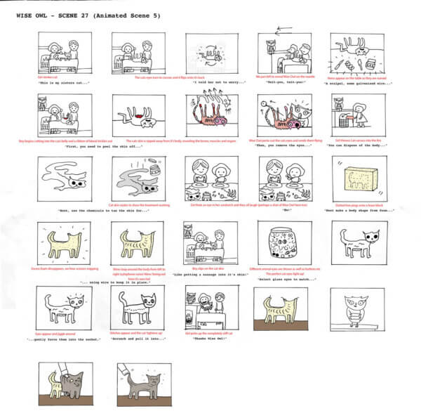
No, I think they thought it was important for me to know absolutely everything, because they needed the animations to fit seamlessly in the episode and not feel like they were just stuck on. In fact, I was there when they were filming the green screen sections with Ronnie (Reece Shearsmith) and I got to kind of direct a little bit as well. That was the very first thing we did, there was no animation done at that point. So I’ve been involved during the whole thing. At first, I was really obsessed with details and suggested that we could add things like subliminal, sort of flashy things, then the producer said “I’m pretty sure that’s illegal and we’re not allowed to do that!” But other little things, like the doll that appears, is made to look like one of the girls from The Shining, but with kind of Coraline button eyes. The kite was meant to be a little like the carpet from the Overlook Hotel, another Shining reference, but without overdoing it too much. It was just red and orange, but it’s that kind of thing. In the carcass of the cat, when they’re eating sandwiches, in the veins I spelt the name ‘Mimsy’ as it was the name of the cat. There were a lot of things that weren’t really easter eggs, but they were kind of alluding to what the story was about. In the background of the living room, there’s a broken brick texture that goes across it diagonally, and it looks kind of weird in the animation. But then you realise it’s in the actual living room in real life. So, we tried to emulate the geography of the room accurately, especially for the scene where the live-action and animation are mixed together.
Wise Owl test animation sequences (courtesy of Sam O’Leary)
Other than this episode, of course, which is your other favourite episode from Inside No. 9?
As it’s fresh in my head. I really enjoyed Mr King. I thought that that was fantastic. I like the horrible ones really. I also like Sardines and A Quiet Night In, they really set up the whole thing of them using rules as a writing tool, limiting themselves and I think that’s such a nice kind of creative commitment. It puts you in a box that you then have to break back out of and do something really clever. So, I really liked those two. I loved The Devil of Christmas, I thought that was absolutely horrible. My all-time favourite is Bernie Clifton’s Dressing Room.
Does rulemaking and setting limits also benefit you as far as the animation process is concerned?.
I’m really grateful that the rule for this was the sort of 70s PSA style, because if they’d approached me and said “The main character goes into an animation world, what do you want to make for that?” I think it would have been a lot harder and it would have taken far longer to find out what that would have been. Because they had such a strong sense of the story, and the animation style wasn’t just picked on a whim, it was intrinsic to the story, I was just really happy because it was such a strong starting point to begin with, so it wasn’t hard to work out what they wanted. It just fell into place.
You can watch Wise Owl and all other episodes of Inside No. 9 on BBC iPlayer. You can find out more about Sam’s work on his website and Instagram.


