Skwigly Theme: Naomi Robinson
It’s never easy being first for anything. There’s an intimidating pressure that results from needing to set a standard. Having your work on Skwigly’s homepage is no exception.
 F
F
or over a month now there’s been an invitation for artists to demonstrate their illustrative skills and the responses seemed unsurprisingly quiet……And then the fog cleared.
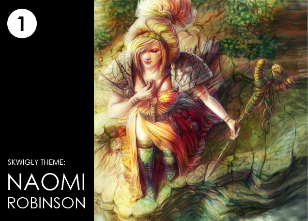
The suspense was stifling but the results are nothing short of breath taking. We knew that the first piece to go up should be something special but nothing could have prepared us for how stunning Naomi Robinson’s work was. Her incredible attention to detail, texture and colour instantly brought visions of adventures, fables and fairy tales.
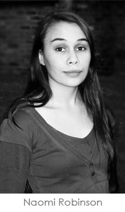
Naomi is obviously inspired by some classical artists as her website, blog and Facebook page are filled with amazing pieces of stunning art each more magical than the last. Regardless of what she does in the future Naomi Robinson is a name to watch out for:
 Where did the idea come from for this particular piece?
I wanted to create a piece that was colourful, hopeful and leaning more towards optimism. I had the initial idea to make the whole image about exploration, which meant the image would look over a large environment. The additional point of creating an extreme perspective was also an intriguing idea, as it would provide an unusual perspective for web users.
Can you tell us more about the character in the artwork and what she means to you?
The female character in the image is an explorer, I imagined her to be a hermit who travels between different cities only to trade the rare and expensive spices, stones and other precious objects she finds in the desert. She would be considered a valuable and wise person within that present culture, but also somewhat of an outsider.
Where did you study and how long have you been involved in digital painting?
I originally studied a BA (hons) in Multimedia Design and Digital Animation, but I really found my interest when I studied my Masters in Digital Arts, both degrees were undertaken at the University of Cumbria. I have been digitally painting as a hobby for 4/5 years, but it’s only really been the last couple of years that I’ve really begun to put all of my effort into creating a freelance career and improving my skills.
Who or what inspires you?
I’ve been inspired by a large number of artists and animators. I have always been drawn to the work of Pre-Raphaelite painters, more specifically John Everett Millais, and also the post Pre-Raphaelite artist John William Waterhouse. The contemporary artists that inspire me are mostly concept artists from film and game backgrounds, specifically Daniel Dociu who is the lead concept artist for Guild Wars, also James Jean who is a prolific illustrator and Donato Giancola, a freelance painter who has worked for LucasArts. Some of the directors and animators that have influenced me most include Hayao Miyazaki, Sylvain Chomet, Guillermo del Toro and Dave Mckean both as an artist and director.
What are you future goals?
I hope to forge a career in concept art as either an in-house artist or a freelance artist. I also aim to continue creating illustrations and graphic novels and hopefully create a few independent publications of my own.
I’m excited for whoever follows Naomi’s piece. Like the story this image is telling I want to see what happens next. I look forward to seeing who will step up to the mantle for us, but then again it’s never easy being ‘next’ for anything either.
Work In Process…
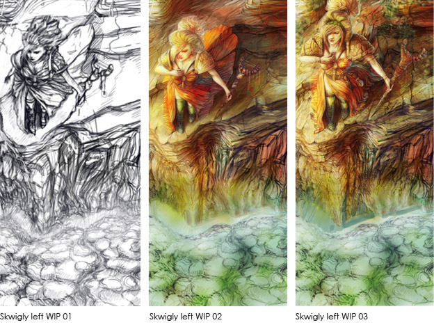
Equipment – Photoshop and Wacom Tablet.
Skwigly Left WIP 01 – I was aiming to make these images quite ‘light’ and ‘hopeful’ so with these concepts in mind I developed a quick digital sketch of a possible idea. I had already decided to experiment with an extreme perspective for this piece, which I thought would be engaging and different for the website viewer.
Skwigly Left WIP 02 – This version shows the very early colour blocking stage. I sometimes develop pieces entirely in B&W until the very end, but I wanted to specifically experiment with colour for this piece. While I was quite happy with the concept of the piece, some elements of the composition and perspective weren’t as strong as I wanted them to be.
Skwigly Left WIP 03 – In this version I addressed these issues, such as the original problems with perspective and composition. I started to play around with the positioning of the character. I found that by enlarging her, and moving her more prominently into the upper third, really strengthened the composition. After this, I continued developing the colour palette and developing the detail from there.
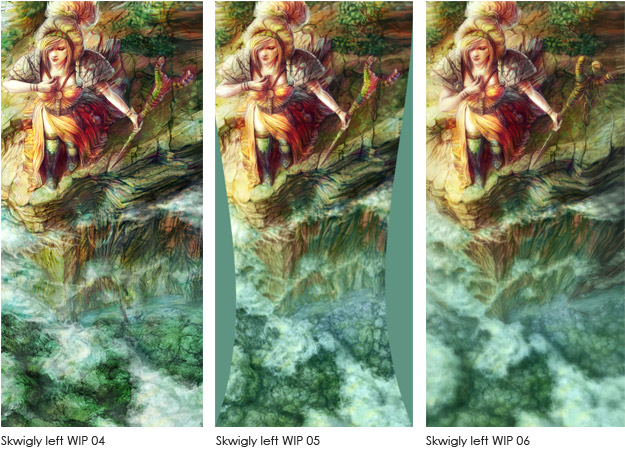
Skwigly Left WIP 04 – In this version I found that the original colour palette used was the same for the character and the rock face, so after a little level tweaking I brought out the greens in the rock face and the reds in the character which seemed to fix the problem. At this stage I was really focusing on creating detail, and adding texture to the surfaces.
Skwigly Left WIP 05 – At this point, I was happy with the level of detail and overall composition of the piece, but I found that the ‘plunging’ perspective wasn’t quite where I wanted it. I experimented with creating a more extreme drop by using the warp tool, which seemed to right some of the perspective issues.
Skwigly Left WIP 06 – The final image developed fully. I wanted to intensify the sense of depth to the piece, so all the elements in the distance, such as the cliff face, clouds, forest and river were blurred. This kept the focus on the main character and provided a better sense of depth.
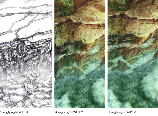
 Skwigly Right WIP 01 – This early sketch shows the start of the right hand image. Creating this image was a much simpler task than creating the left hand version. I wanted to extend this world for the character onto the right website panel, so I began by flipping the image in order to preserve the environment continuity and to also speed up the creation process.
Skwigly Right WIP 02 – This image was originally the flipped version of the final left hand image, with the character quickly painted out.
Skwigly Right WIP 03 – For this image to seem continuous with the left, the perspective needed to be altered to match the focal point which was on the character in the left panel. In order to match this focal point the image was warped towards the left.
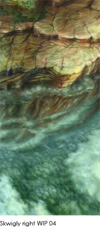
Skwigly Right WIP 04 – This is the final version of the right hand image. A little more detailing was added to the image, and all the elements, such as rock crevices and clouds were matched up between the images. As a final touch, all of the objects in the distance were again blurred to create an intensified sense of depth.
Bio:
Naomi Robinson is a freelance digital artist and designer, producing a broad range of creative work from concept art, to 3D modelling and also website and logo design. She has a particular passion for film and game concept art, and hopes to forge a career creating concept art in the future. Outside of art she likes to read, watch foreign films and 3D animations, and of course, all of these activities are enjoyed with copious amounts of tea.
Naomi’s Art Blog: www.naomirobinson.blogspot.com
Naomi’s Facebook Artpage: www.facebook.com/Naomi-Robinsons-Art/
