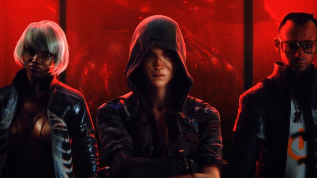
Love Death + Robots: Review of the new Netflix animated series
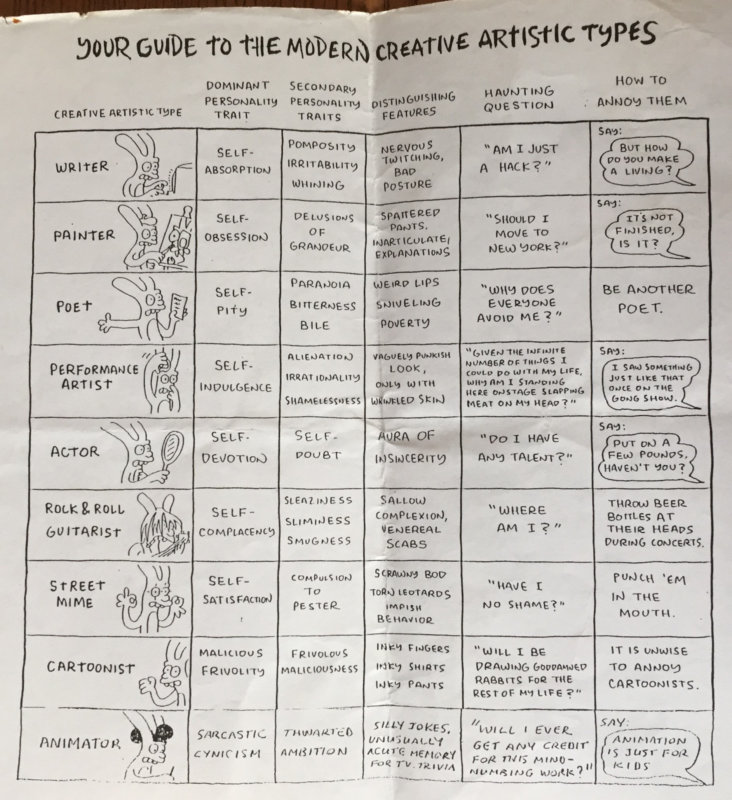
Years ago when I was going through my slight obsession with The Simpsons ( I assume we’ve all been through this, right?) I bought a book of cartoons called Life in Hell by the great Matt Groening, made before his TV show took over the world. If you haven’t seen it, google it; it’s great and it’s mostly online now. One strip was called “Your Guide to the Modern Artistic Types”. Here’s a photograph of a photocopy*:
In this guide, (apart from noticing that its so long ago that Web Designer is not a thing yet, and Graphic Designer or even Designer are not considered a major type) you will notice that under the section for “Animator / How to Annoy Them” it says “Say animation is just for kids”. This is still pretty true. In fact I still punch anyone who says it.**
The concept of “adult animation” is generally still regarded with suspicion by Western commissioners and execs. The underpinning assumption for this seems to be; animation is just for kids.
Even though : Anime! Ok, it’s not a western thing but millions of western young adults enjoy it.
Ah, the commissioners would say, but that’s just a cult thing in the west, just for geeks, right?
OK what about all the western animation that IS popular with many non geek adults, Rik and Morty, Bojack Horseman, Family Guy, American Dad, Duckman (more obscure but my fave!) and so on. Even the daddy of them all again; The Simpsons.
Ah, the execs would say, these aren’t to be taken seriously, just silly little cartoons, like the comic strips in newspapers. Not like the main part of the newspaper where the proper grown up stuff is, the adult themes, love, hate, war, technology, religion, violence, sex, death and robots. That stuff’s not for animation, because basically animation is just for kids.
In fact, if you don’t count all the animation embedded in adult mainstream VFX movies, the various western attempts to make “serious” adult animation you can almost count on your fingers (if your feet had fingers that is).
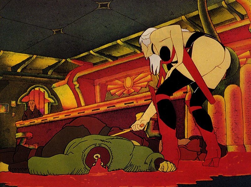
The list might include Yellow Submarine (1969, although this would be classified as “family audience” now), Animatrix (perhaps the closest comparison to SD+R), MTV’s Liquid Television (Aeon Flux etc), indie films like Waking Life (2001), A Scanner Darkly (2006), Rennaissance (2006), Persepolis (2007), Fears of the Dark (2008), Waltz with Bashir (2008), The Illusionist (2010), Ethel and Ernest (2016) and slightly odd performance capture movies pretending to be live action like Final Fantasy (2001) and Beowulf (2007). Perhaps the biggest mainstream example though is the legendary Heavy Metal (1981) (and to a lesser extent it’s sequel Heavy Metal 2000 (2000).
This film derived from the adult graphic novel type fantasy magazine Heavy Metal, which was a geeky teenage boys stoned fever dream of lost civilisations, spaceships orbiting psychedelic planets, exotic monsters, intergalactic commandos and beautiful women usually without many clothes on, which was brought to you by such brilliant artists (and more heroes of mine) as Moebius, Drulliet, Giger, Richard Corben and Bernie Wrightson. A particular favourite of mine was Tamburini and Liberatore’s RanXerox strip.
The US magazine was translated from the French version “Metal Hurlant” (adult comics have been a big thing in France and other Euro countries for a long time) and so the title is nothing to do with Heavy Metal music. It is certainly quite Rock’n’Roll though and the film is such a midnight movie favourite that it practically emits cannabis smoke as you watch it.
Such fumes were certainly wafting in front of the screen when some older boys took me along to my first late screening, Heavy Metal, and also in later years when I watched it at some godforsaken hour at London’s legendary Scala Cinema***
It certainly made an impact on me at that impressionable age, the opening sequence as a car flies out of a spaceship and heads to earth as the commuter astronaut arrives home was ingrained on my tiny blown mind for ever. I later found out this was made by TVC, the studio where I started my animation career a few years later.
Turns out Heavy Metal also had a similar effect on the youth of Tim Miller, now famous for being owner of California’s Blur Studios and director of Deadpool. He got talking to David Fincher, famous for being David Fincher, also a fan, and about ten years ago they announced they were going to do a new version of Heavy Metal. Cue ten years of meeting with the above mentioned adult animation averse execs with no luck, until eventually they pitched to Netflix, who it seems, due to their business model, are a bit more open to new ideas. And Love, Death + Robots was born; a re-imagining of the Heavy Metal project.
First to say, these films are all beautifully crafted, luscious animation made with (I imagine) luscious budgets. The idea of “adult” animation is open to interpretation however; although these are definitely adult in the NSFW sense, most are pretty close to the 14 year old juvenile male fantasy space warriors and naked nymphs of the original. “Breasts, Cats + Robots” might have been a more accurate title – there does seem to be a large amount of these – but I guess breasts and cats is what basically drives the internet and Netflix is the internet right?
OK, so to get on with what I’m supposed to be writing about, the actual Love Death + Robots.
First of all, I love the intro sequences, with an animation peg bar turning into icons of Love, Death and Robot and then into icons for he specific show. I mean do most people even know what a peg bar is any more? That’s what i like about Netflix, it doesn’t care what most people know about, it just wants to have cool stuff.
Incidentally the title sequence is similar to the other thing its going to get compared to a lot; Black Mirror. Personally I don’t think the stories are as good as Black Mirror, on the whole, but the visuals are more interesting, on the whole.
So then, roughly in descending order of preference first we have (and I know everyone’s order of preference would be different, because I’ve seen other peoples lists, but this is mine):
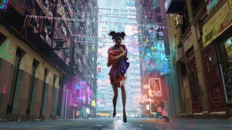
The Witness. This was my favourite, a kind of pervy goth noir set in a quiet suburb of Blade Runner. Now I did think at the time, and I’ve read since, as mentioned above, certain issues with the series’ over gratuitous female nudity and I know The Witness is probably the worst offender of that. But the lead character is a sex worker, I guess. And the whole series is derived from Heavy Metal magazine, which is pervy to be frank, in the way that all heterosexual 14 year old boys are pervy. So lots of breasts, but not many cats in this one.
Anyway, moving on from that; The Witness is rather brilliant. Mainly because it looks utterly amazing (especially as I saw it at the quite luxurious press screening on a fab big screen with a free beer).
It was directed by Alberto Mielgo, who was “visual consultant” on Spiderman and the Spideyverse . Which apparently means, according to his facebook post, that he was hired as Production Designer/Art Director and then after 2 years of amazing work he fell out with Sony and left, so they credited him as that. You can see his designs here – and I think it’s clear they made their way into the striking visuals of the Spideyverse film. He has also made his own experimental films like Pinkman, which are closer in style to The Witness.
Mielgo’s technique seems to be some form of enhanced live action but apparently isn’t. The animators seem to use live action as a strong reference to create the animation, which is all hand keyed, and then some great cloth sims added to for the clothes, along with some wobbling flesh algorithms. Added to this, I suspect, they kind of digitally paint and/or map CG over animation and video backgrounds, possibly a bit like the the methods of Bob Sabiston, ( Waking life /A Scanner Darkly )?
I’m not exactly sure how it’s done but it looks great, and I’m curious. And they’ve done that thing where the animation runs at different frame rates from the camera. And all kinds of tricks like that. To me, its fascinating.
Aside from the visuals, to underpin this is a frenetic looping violent narrative set in the seedy sex industry of a future dystopian city ****, which is probably voyeuristic and possibly misogynistic (although then perhaps you would have to say the same about every horror film with a woman in peril ?). Without wishing to spoiler alert, the hero turns out to be not the passive victim as first presented, which I guess could be argued re-balances the power dynamic?
My second favourite is Zima Blue, adapted from an Alastair Reynolds short story (as is another of the films Beyond the Aquila Rift). Directed by Robert Valley, who I am also a fan of, for Passion Pictures, who also has a fantastic and unique visual thing going on, a stylised 2D and detailed animation style that’s totally his own.
Zima Blue tells the story of a mysterious artist of seemingly superhuman talents who invents a new colour blue, which gives a clue to his origins. Interestingly Valley had seemingly worked with Mielgo at one point, on the beautiful intro for X-Box Beatles Rockband.
Bronze medal goes to Three Robots (directed by Victor Maldonado and Alfredo Torres for Blow Studio), a more light-hearted story this time of post apocalyptic robots and cats. The film is in a more conventional 3D, CG style and features (guess what) three robots with nice design reflecting distinct archetypal personality types, witty dialogue and features an amusing and unpredictable ending.
Forth champions league spot for me goes to Fish Night, directed by Damien Nenow for Platige Image Studio. A lovely cartoon rendered, Twilight Zone-esque CG entry, with a psychedelic ending, another good one for the Midnight Movie (or TV) stoners.
My next would be Ice Age, directed by the main creator of the series, Tim Miller for Blur Studio . If you’ve ever found a forgotten tomato in the back of your fridge evolving into a new life form this one’s for you. Again, reminding me of the tone of The Twilight Zone, this is a live action short with an animated Sim City-like civilisation existing in the ice box of a couples inherited old fridge. Well made, well acted, well written, disappointing ending though for me, and endings are everything in these type of shorts.
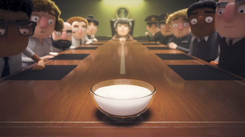
I also quite liked the two silly cartoony entries When the Yoghurt Took Over and Alternate Histories, which give some more light relief to the general downbeat tone to come. I’m now noticing about myself that five out of my top seven so far have been in a more light hearted vein. Maybe I’m just a bit bored of depressing future dread. OK, Trump and Brexit, I know, I know, but we can get over these bumps in the road and then consign the idiots and haters to history right? Maybe? If we just calm down with all this doom and gloom, you know? Because if everyone believes bad things will happen, it can become a self-fulfilling prophecy and I want some kind of planet left for my kids to grow up in yeah? So I like to see some nice alternate futures. Bit like the Alternate Histories, as shown here, with Hitler being bumped off in may amusing ways before he can do the damage to mankind. (This one is very cartoony 2D and was directed by Victor Maldonado and Alfredo Torres for the excellent Sun Creature Studio in Copenhagen)
Then When the Yoghurt Took Over, (which is directed in a very stylised cartoon geometric CG style, again by Victor Maldonado and Alfredo Torres at Blow Studio (yes thats Blow not Blur, not a typo), does what it says on the pot, the yoghurt takes over. Quite amusing.
The one I liked next is Helping Hand directed by Jon Yeo at Axis Studios. This is one of the photoreal CG films on display and takes a Gravity esque Ground Control to Major Tom type scenario and injects a nice dash of horror. I have actually seen a similarly gory type of idea in John Hardwick’s short film To Have and To Hold from a few years ago but this gives a new zero gravity spin. I’m trying not to mention the uncanny valley thing too much in this article as it will enrage fans and creators of photo-realness (so from now on I’ll just say code word Unva) and it has got a lot better admittedly as tech has improved, but for me its still a distraction. It wasn’t a big issue in this one however, I think because the character isn’t your conventional archetypal sex kitten or hunky action hero and is more of a real character which makes you kind of buy into her more. Also she has a helmet on most of the time so the eyes are a bit shielded.
My next best two are also in a slight tongue in cheek mode, The Dump directed by Javier Recio Gracia for Able and Baker Studio and Suits directed by Frank Balson for Blur Studio again. They both remind me of the story in of George Romero’s 1981’s horror portmanteau Creepshow, called The Lonesome Death of Jordy Verril, in which a redneck (played by the writer Stephen King himself) is terrorised by a weird alien. (Sorry but this is what happens when you get old, stuff always reminds you of other stuff).
In The Dump a redneck who owns the dump is terrorised by a monster and in The Suits a family of rednecks who own giant mech suits are terrorised by aliens. A well as the redneck element, its the comic book like quality to the proceedings which reminds me of Creepshow, which in these two is very nicely illustrated by cartoony style CG, which I personally prefer to the photoreal style. I think, for me, I just buy into the stylization ones easier and don’t keep getting pulled out of the story by noticing bits that aren’t quite as super real as the other bits (mainly the eyes, which are never quite right and I suspect never will be).
My next best one was Lucky 13, another photo-real styled one, directed by Jerome Chen at Sony Pictures Imageworks, a pretty interesting story about a kind of haunted space battle ship. Again with this one the, er, you know, Unva, didn’t bother me TOO much as the character was a non cliched non archetypal believable one and again she largely wore a helmet so I couldn’t see the eyes that much.
Sucker of Souls by Paris’ excellent Studio la Cachett and directed by Owen Sullivan is another comic book looking one. The studio is formed by ex students form the great Gobelins animation college and it shows in its lovely execution. Great craftsmanship, colours, cats, drawing, and animation; even if the action movie Indiana Jones storyline bored me a bit and some of the dialogue is terrible, including an awful “eating pussy” joke.
Then we have the other photo real ones. Sonnies Edge, Beyond the Aquila Rift and Secret War. Now don’t get me wrong these are beautifully modeled and lit and motion captured and all that, so I don’t want to be dismissive but they aren’t my kind of thing. Maybe I’m too old to be the target audience for these. The are very much in the video game cut scene type of harsh dystopian future tales owing a lot to the Alien franchise universe (which I love by the way) and bits of the Matrix thrown in, with added sexy femme fatale type women who often divest themselves of their tops and battle hardened warrior action alpha males who’s main hobby is fighting aliens with oversize guns. The voice acting often seems a bit overdone in these ones too for some reason.
Sonnie’s Edge (directed by Dave Wilson at Blur Studio) has a Street Fighter/ Tekken type scenario in Mega City London with a reasonable surprise ending. It features some stock cockney gangster types and the hero wears a Northern Soul badge for extra Brit credibility.
Secret War (directed by Itsvan Zorkoczy at Digic Pictures) has a bunch of battle hardened WW2 soldiers fighting some kind of undead alien hive colony, resulting in non stop action, explosions and gore. Slightly more stylised this one, which works in its favour.
Beyond the Aquila Rift (directed by Phillip Gelato at Unit Image) has the battle hardened Mel Gibson type ship captain waking up early from his Alien style hibernation pod to be seduced by a sexy blonde space vixen, but is she really who she pretends to be? Is anything what it pretends to be? Well the humans certainly aren’t what they are pretending to be because they all have those kind of waxworks, not quite-exactly-right-a-lot-of-the-time eyes and skin, although they are pretty close these days, and Im definitely not going to say, you know, Unva again. The blonde bombshell is the most real, pretty impressive jiggling flesh, so i guess they spent the most money and time playing around with her body parts. Although she is burdened with terrible lines like “I always think men are sexiest when they try and think” which came somewhere round the scene where my thoughts wandered off to this award for bad sex in films that I read about, and how the motion capture for this bit would be weird, and how it was all happening under a rather distracting gorgeous space scape with a billion meteorites drifting around in the coloured mist.
Which does kind of beg the question for me, why not just use real actors in a blue screen studio? Then we could just focus on the wonderful environments and cool weapons and gnarly aliens and great VFX and stuff instead of constantly going “wait, that eyelid looks too thick”. I tell you what would work great, would be a zombie film where the zombies are all photo-real CG and the humans are all human, because then the slight occasional creepiness would be a plus point. HEY THAT’S MY IDEA; DON’T STEAL IT!
Then there’s two sort of Anime style films, which I didn’t take to too much. Not because they are Anime style, they just are a bit cliched and uninteresting, in look and content. But then again so is a lot of Anime, to my mind. Blindspot, directed by Vitaliy Shushko is about some robots robbing a convoy in some future world. It also features kind of future cats. Good Hunting directed by Oliver Thomas at Red Dog Culture House is a kind of animated Crouching Tiger Hidden Dragon with werewolf things that are a bit like cats.
Overall though I have to say the bar for the quality of these is set really high and they are a welcome addition to the animation universe. I hope everyone tunes in and they then make lots more because it can only be a good thing. I wish I was a 14 year old these days, because wow, they certainly are spoiled rotten.
Another thing I kept reading about with this series is that Netflix uses its algorithms to send these out in an order according to the subscribers sexuality. Well with me, they obviously considered that I’m too old to even have a sexuality so they just sent me the cats ones first. Ah well, I’m happy with that because I really like cats.
* A photocopy was a primitive form of quickly reproducing an image or text, invented by the Rank Xerox corporation in 1959 (the name coincidentally borrowed for a strip in Heavy Metal see above). Mainly used at every decent office party to photograph bare bottoms but also used in the animation industry to transfer the drawing onto “cells”. Cells were used for…. oh never mind just google it.
** Not really
***Yes you could smoke in the cinema in those days. Great it was.
****Incidentally, is there any of these films that isn’t dystopian? Hey, the future might actually get better, you never know! It pretty much has so far for most people! Jeez.


