Interview with ‘Lost Property’ Director Asa Lucander & Animator Marc Moynihan
Lost Property, the short film from London based studio 12foot6, is the brainchild of Åsa Lucander. Originally from Finland, Åsa now works as an illustrator, animator and director in London. Her work consists of hand-drawn line and texture based imagery. This strong, unique style has made her a valuable asset to the studio, with Åsa lending her hand to some of their most well established client projects including the BBC, Virgin and Radio 4.
Marc Moynihan, a graduate from the Cambridge School of Art, had been working at 12foot6 and, after working with Åsa on varies projects including Dara O’Briain’s Science Club, was able to work on the backgrounds and animation for Lost Property.
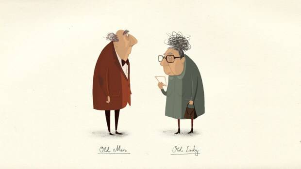
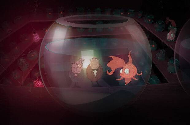
The film sees an elderly duo on a journey of discovery; Concealed in the collection of hidden rooms in the Lost Property office are remnants from their past. The film looks into the idea of memory loss and the aging proses, exploring how memories shape who we are and how we move on in our life. This beautifully-realised film uses digital painting, by converting Åsa’s loose, characterful designs into highly detailed and masterfully-coloured counterparts.
The film premiered at this year’s Edinburgh Film Festival and is currently touring the festival circuit.
We took the opportunity to sit down with Åsa and Marc and discuss the film’s origins and the labour-intensive proses of making the film itself.
Could you explain for the benefit of our audience that may not of seen the film yet, what the film is about?
Åsa: Lost Property is a love story, but above all it is about the fragility of the mind – how we take it for granted, and how lost we are without it. It is about hope, persistence and devotion. It portrays an illness, alzheimer’s – that robs us of who we are.
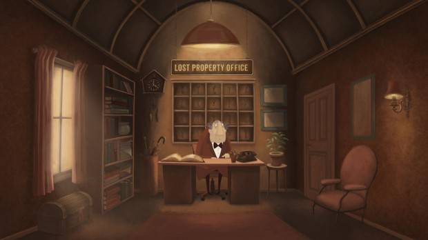
Our memory is so fragile, yet so deeply ingrained. It’s about how we cope with it, and how it affects others. The film touches on these things, yet on the face of it, it is a simple tale in a lost property office. I see the lost property office as a metaphor for the mind. Shared memories are tucked away in hidden rooms, waiting to be found.
Tonally, Lost Property is heartwarming and visually engaging, with an ending that has an emotional twist. The film contains no dialogue, which means that the visuals and music will work coherently to carry the story forward beautifully. The animationis 2D, using colorful palettes with a mixture of textures. The strong use of light sources ads to the drama and emotional tone that runs through the film.
What first inspired the idea behind the film?
Åsa: The idea for the film came to me about a year ago, when listening to the radio, and someone was talking about a lost property office. I thought the subject matter sounded very interesting. All the very strange things that people leave behind or lose in one way or another. Where do all these objects go? There must be a whole world somewhere full of unmatched socks, ringing phones, forgotten umbrellas and so on.
I found this world could be an intriguing starting point to base a short film on. Developing the idea further I imagined that a Lost Property Office could represent something else, be a metaphor for something different – our mind.
All the items are there because we have in some way or another forgotten about them. And all the objects are carrying a story, has their own tale, and means something special for the person it belongs to. It might be an insignificant object, but the story that is attached to that object, might mean the world to someone. The Lost Property, is storing all those tales. All the different memories are tucked away in hidden rooms, just waiting to be found.
It was this subject matter I wanted to explore, and build the story around. Achieve an emotional impact and make people aware of what our memory means to us and those around us, and do this within the walls of a Lost Property office.
From that point what went into the development of the film?
Åsa: After the initial idea, the script came fairly quickly to me. I had one of those rare moments of having a dream, and when I woke up all the loose ends tide together and I pretty much wrote down the script there and then, 5 o’clock in the morning.
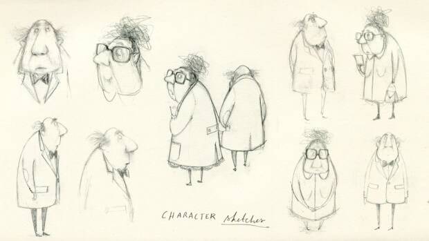
Then I started to develop the characters and storyboard, and once they were established we moved onto the backgrounds, and that’s when Marc joined in to work on some of the background art. Both our styles work really well together. His skills on lights and colors are excellent. And we definitely influenced each other and developed a painty style suitable for the mood of the film.
Marc: We had both experimented a little with digital painting in the past. Throughout this process we were sort of learning and teaching each other as we went. As one of us would find a good Photoshop brush we would inform the other.
Åsa: I wanted to design something visually different from what I have done before, and explore digital painting in Photoshop. I tend to use a lot of black and white characters in my work, to make the job of animating them easier. But this time, I knew I wanted to have lots of color. And once me and Marc started to explore the color palettes for the background we spent a lot of time getting the lighting and mood of the film right.
It gave us an opportunity to use different brushes and a strong use of colors and create a atmospheric feel to the scenes.
What role did colour theory play in the film?
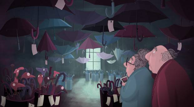
Marc: There is an obvious separation between the rooms and the office in terms of a colour palette. We defiantly wanted to separate the rooms from the office and make them more imaginary. The rooms are more brightly coloured and the office with a duller saturation.
Åsa: The idea was also to distinguish the different rooms with the help of a rich color palette. And separate the more realistic lost property office from the more imaginative rooms filled with lost property.
When you approached the producers Tom and Dave at 12foot6 how did you pitch the idea to them?
Åsa: First I said I had an idea for a film, explained the story, they liked it but they weren’t sure if they could fund it. So I went away and wrote the script and created some of the art, and I think it was the art combined with the story that probably sold it to them.
12foot6 has been very good in recognising the importance of personal projects and giving us an opportunity to explore new media and different ways of expressing ourselves in forms of self funded projects and short films when there is a bit of down time in the studio. This film escalated into something much bigger and longer than first planned thou.. But it was a true labour of love, with a lot of overtime, long nights, and amazing input from everyone involved, and I hope it will be worth it in the end.
It is always hard to estimate how long a project like this would take. Specially when its such a personal one. And I think that everyone wanted to make it as best as they could, and that always take longer. We were struggling against time in the end, and had to make some compromises.
Did you have days you could spend on it during work hours or did you have to do it in your own time?
Marc: I was in and out of it due to other commercial projects to begin with; Åsa was working on it pretty much full time since August 2013. I started working full time on the film from around November and we got another five animators on board to help out. I know Asa pretty much worked through her weekends and we did some crazy hours to get the job done.
Could you tell us a little about the techniques and software you used during the film?
Åsa: The backgrounds are painted in Photoshop and the characters created and animated in Flash. And some animation is done in After Effects. We then collaborated with Rushes Post Production House, where the scenes were treated and color graded by the talented team at Rushes.
Marc: The character animation in flash was animated on different layers so each layer could be treated separately in post production. Mostly to feather highlights, add glows and shadows to characters.
And for you Marc, it was your first professional short film, how did you find the experience?
Marc: I luckily went away for a month in the middle of it (laugh). No, I found it really great. I had creative input on the titles and some of the backgrounds, obviously this is all Asa’s project, but she did give me a lot of freedom. I also got to animate, which I really enjoy.
Is this style something you’d try again?
Åsa: Yes, would love to. Though it depends on the job, the art does take some time to create.
Is the plan now for it to go into festivals?
Åsa: Yes!The film had its premier in Edinburgh Film Festival and will be screened at LA shorts, ASFF, Raindance, Encounters and so on.
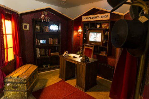
I’m also doing an exhibition in Finland at the moment, called BY (meaning: village) that is also to do with the film. It’s a collective exhibition together with a group of Finnish children’s book illustrators. The aim is to reach international audiences with a playful mobile exhibition that would delve into the world of illustration and animation and will be on tour in Europe this year and next. Each artist got given a container in the shape of a house that would open up and the artist could exhibit his or her art inside the container. I made my container into a Lost Property Office, with projections of animations and the Lost Property film. In October the exhibition will move to Germany, Frankfurt Book fair 2014.
Lost Property will screen at this year’s Encounters Film Festival in Bristol on Thursday, September 18th as part of their 4pm screening Love, Loss & Loneliness. For more information on the film and the artists you can visit asalucander.com and mmoynihan.tumblr.com


