Q&A with Kerstin Zemp (‘Living Like Heta’)
UPDATE 21/20/2019: Living Like Heta is now available online in full (watch below)
The immensely enjoyable Living Like Heta has been charming audiences the world over with its combination of appealing design and quirky animation, telling the unusual story of the titular Heta who lives a life of carefully regimented routines involving cut hair, magical breast milk and a pet seal who lives in her bathtub. Directed by Bianca Caderas, Isabella Luu and Kerstin Zemp as their final graduation film at the Lucerne School of Art and Design, the film has enjoyed an enormously strong international festival run of 80+ events including Encounters, Tricky Women, Animafest Zagreb, the Melbourne International Animation Festival and Interfilm, picking up awards at Golden Kuker, Fantoche and Balkanima among others.
Having recently screened this side of the pond as part of our Skwigly Screening at the Manchester Animation Festival, the film’s next UK outing will be this weekend at the London International Animation Festival. We spoke with designer and co-director Kerstin Zemp about how this endearingly unique film came to be.
Where did it all begin for you and the team behind Living Like Heta?
We all met when we started studying animation. Personally for me I graduated from high school and I was really into art all my life, drawing, but I never thought about animation as something I could do or study. It’s mandatory in Switzerland that you do one year at the art school, where you learn about all the different courses before you apply to a specific one. In the last few months of that year I discovered animation and took a course and fell in love. For me it’s like illustration-plus, where you also get the element of a film, of a story, making things move. So it was clear for me that I wanted to do 2D animation and not 3D because I like the drawing process, and then I started the three-year study. I had a gap year before to really think about it, because I really love animals and I wasn’t sure if I wanted to be a veterinarian or an animator. But I’m really glad I made the decision to study animation, especially as the people who study animation are all weird mostly, so it was good crowd in our school. Then in the third year we just spent more or less a whole year for our graduation project. Bianca and Isabella and I were friends who knew we could work together, so that’s why we decided we wanted to do a project together. It was important for us that we start off the project as friends who wanted to do something nice and fun, not just one person with one idea they needed help with. That started the one year of madness!
So what sort of work were Isabella and Bianca doing at the time?
Our styles were really, really different. Isabella did more realistic illustrations inspired by Asian culture – she’s Chinese and her interests were more in Anime and Manga, so her style is really detailed and she takes a lot of time to make one piece. Then Bianca is more ‘out there’, she’s less interested in making things look how they look in real life, it’s more about having ideas and colours and concepts. So they were really the opposite poles, and I was more in-between.

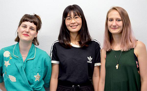
(L-R) Bianca Caderas, Isabella Luu and Kerstin Zemp
Was that dynamic reflected in putting the story together, or was that more from one of the three of you?
Actually we were all surprised by how easily the story came together, we were sitting and we had some beers and started talking about what we like. We wanted to make something really surreal, not something that could exist in real life, and we had a few words – ‘fat’, ‘ugly’, ‘naked’, ‘flesh’ – like body awareness. Then I think the idea of rooms came from Bianca , different rooms, overlapping stairs, things like that.
So for some of the specific concepts that are in the story – the shrinking milk for example – did they come from bouncing ideas around?
Yeah, we had so many more weird ideas in the beginning but because we had one year for our film the teachers made us work a long time, at least two, three months, on the story, and also the storyboard. We knew we wanted to have a finished project and not have to stop halfway in, in July when we wanted to graduate, so we had to sometimes cut out ideas. We talked a lot with other people about it, to see if they still could follow the story, because sometimes you get caught up in your own ideas; for the three of us it was so normal, what the milk was doing, and trying to explain that to people helped us. So the idea was way bigger and, through working on it, it took more shape.

Living Like Heta (Dir. Bianca Caderas/Isabella Luu/Kerstin Zemp)
One of the main themes of the film, or as a kind of through-line, is the element of routine, a sort of obsessiveness, was that something that the three of you had a vested interest in?
I think it was maybe not specifically routines but more social anxieties, how we sometimes get caught up in our own behaviour without realising it. I think that was a point we were all really interested in exploring more, without making a movie that has to teach or preach something, or force an opinion on the viewer. The routines and repetitive stuff is definitely in there, we just wanted to bring that out more in a playful way than you would in an educational movie.
Looking at you character illustration work, the overall art style seems to mostly evoke your style, would you say that’s accurate or is it more of a fusion of each of your styles?
Actually we had different roles while we were making the movie – Bianca was more backgrounds, Isabella was more about colour concepts and design while I did the character designs. First we started off with the illusion that it would be possible for each of us to design a character, but because our styles are so different it looked really bad! So we decided that just one of us would do the design. When we started the movie my work was more cartoony and we tried a few elements of that but then considering Isabella’s love for details I started drawing with more lines, also more of an Asian look. So I feel like I developed and made a big step in my art style from working together with Bianca and Isabella. So while I did the character design I feel like I have never drawn like that before, it was heavily influenced by the group
Did you all pitch in on the animation itself?
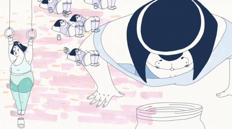
Isabella took the lead for animation so she had the most work to do, but we wanted to all animate a few bits. We also had additional help from colleagues and the second and first years helped us animate easier things like the gym, which was a big help.

Living Like Heta (Dir. Bianca Caderas/Isabella Luu/Kerstin Zemp)
Can a you talk about more about the development of Heta’s character in particular?
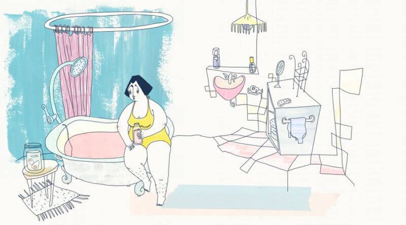
For us it was clear from the beginning that we wanted to have a female lead character as we identify more with the female body. Now we really talk about Heta like she’s a person, it feels like she is our mutual child. Visually I really like to draw characters with volume rather than just stick figures, but for the character I feel she’s more like Isabella, because Isabella keeps more to herself and isn’t so out there. That she cuts hair is from Bianca, who used to be a hairdresser before she studied animation. So yeah, I feel like for me Heta is now just this woman, she’s happy how she is, because she made her world function in a way she felt happy in it. There’s only one person she allows inside her house, but can only step up to that certain point and never any further. So she wouldn’t be alone we gave her a pet she could care for, and that’s where the seal came in. So I feel like we started with Heta and then added other characters to make her world more complete, in a way. Some people say it’s really sad what happens at the end, but for us it’s the only way she could have gone, to still exist – but she’s not sad because she’s still in her world and at least in one form again.
You mentioned about wanting to be a vet before, I’ve noticed animals come up a bit in your work. Was the introduction of the pet your idea?
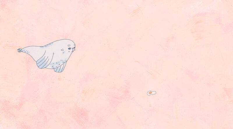
Yeah, I think I’m the biggest animal lover of the three of us but we all wanted to give her something she could take care of, and a human, a baby, would not have been Heta, and a dog or a cat was a bit too normal for the world we wanted to create. Actually my brother, when he was young, always wanted to have a seal. When my mom said that there’d be no space for it to swim he’d say he’d just keep it in the bathtub! Then we kind of had this idea but because we wanted to give the seal enough space to swim we introduced the milk that would make it shrink, and so on. So I feel like the whole story added up from these different things we wanted to introduce, which led to other things.

Living Like Heta (Dir. Bianca Caderas/Isabella Luu/Kerstin Zemp)
Yeah it’s nice when ideas lead to other ideas and it builds organically like that…
Yes, we didn’t have a set idea of where we wanted to go when we started, it just developed by itself.
Was it always the plan to have it be a film without dialogue?
We always wanted to make it without words, because we were so much about the movement and telling the story in pictures. She still makes sounds but we didn’t want to have a set language, so in any country you can identify with Heta without having to read subtitles or anything. Plus you can save so much work if you don’t have to do lip sync!
Well certainly in terms of the international festivals it’s had a very strong run so far. Do you think the three of you will continue to work together down the line?
Actually Isabella is studying for a Master’s, and Bianca and I both needed a break from study and everything – I moved to Belfast and she moved to Germany, but she started a project I was a bit involved in that I’ll also be animating a few parts of. So she’s doing her own project and I’m more helping, she’s the director. It was really nice to work with her again – we’re still working on it, hopefully it’s going to be finished in like three, four months, but she’s started studying again as well, so it’s going to be more of an after-work project.
Living Like Heta screens at the London International Animation Festival in International Competition 1: From Absurd to Zany at 7pm December 1st at the Barbican. See more of the work of Kerstin Zemp at kerstinzemp.com and her Instagram.

