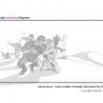
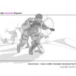
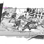
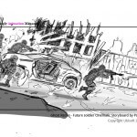
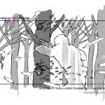
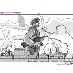
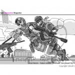
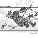
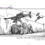
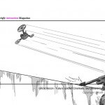
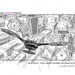
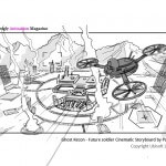
The Making Of Ghost Recon: Future Soldier (Cinematic)
For those working in the animation industry, working for a client such as Ubisoft must be a daunting experience. However it all seems to be in a day’s work for those at Psyop (the same guys behind the Twining’s Tea Advert).
Creating an animation as visually stunning as the one for Tom Clancy’s Ghost Recon Future Soldier provokes its own questions (HOW did they do that? Should I just give up now?) Fear not, because Skwigly recently had the opportunity to take a fascinating insight into their methods, and how they managed to portray such a strong message in such little time.
This interview is for anyone who’s interested in animation, used to read Tom Clancy and everyone else in-between.
The Interview:
Laurent Ledru – Psyop Creative Director
David Chontos – CG Lead
Lane Jolly – Compsiting Lead
Luisa Murray – one of the Producers.
Q. One of the appeals of the film is its dark, stylistic approach. How did you decide on this method?
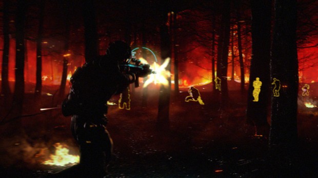
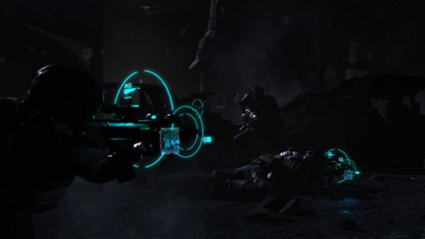
Lane: Being that it’s a short and very fast-paced commercial, we needed something to grab the viewer’s attention right from the start. Through the lighting, we were able to get the characters to stand apart from the darker tones and pull the eye around the frame to see the various shapes of the figures and details of what each shot is conveying. We also used a lot of rim lighting to accentuate the surface and contours of the characters. We wanted to show in such a short amount of time that they were soldiers with super cool tech gear.
We wanted the characters to fall into shadow firstly, to convey the sense of camoflauge and the way they blend into their environment, but secondly to make the climax point of the action in frame much more dynamic when the lights and machine guns go off. It being so brief and fast, we decided to just make it action-packed as there just not enough time for subtlety.
Q. Were you given much freedom by Ubisoft, or was it a case of sticking to a very specific brief?
David: We were given an unusual amount of freedom with this spot. We had existing assets to work from, as well as am established visual framework from their previous campaigns, which enabled us to concentrate on the details; the textures, the environment design, character animation, the cameras and the edit. It was really fun for us to have so much trust and such a clear vision from our clients.
Q. Were there any key moments when carrying out your research?
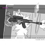
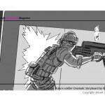
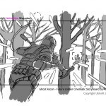
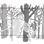
David: There wasn’t a lot of research involved. We were provided with the assets from the game, to which we added some more detail. The visual style, the concept, and the technical approach was really straightforward so we just went for it. Most the of the time was spent designing and laying out the environments, as well as fine-tuning the lighting and effects to really polish the look.
Q. What software packages were used? Are there any specific software you’d advise aspiring VFX workers to concentrate on?
David: The whole spot was done in Maya, rendered in Mental Ray, and composited in Nuke, with a little After Effects for the end tag.
Lane: From a compositing standpoint, Nuke’s 3D aspects were used for quite a few things in this commercial. A lot of the smoke, little fires and steam elements were all tracked in via a 3D camera on a card in Nuke. It works great, and anybody looking to get into the field should become comfortable with the ins and outs of that process.
Also, working with 3D passes is excellent knowledge to have. Not only on how they go together, but what they actually are, how they’re made, what they can be used for and what can be pulled out of them. Even though every pass has its niche in the overall build of a scene, we used a lot of passes for things that they really weren’t meant to be used for and it’s good knowing that going in, as you can plan on that being the case down the line when you’re in full production.
Q. Concept art can often be overlooked by students rushing to meet deadlines. How important do you feel it is to invest this time during pre-production?
Laurent: It’s really important — a necessary step, actually. Finding a concept first and then figuring out how to illustrate what’s in your mind isn’t as easy as one might think, and so having a designer who is able to synthesize the concept and the look is key!
Q. How much time is allocated for the different stages of production? Can you break that down for us?
Luisa: The schedule was very tight. Once awarded we spent a week on concept design, followed by two weeks of previz. Because of the short schedule we were doing modeling, rigging, texturing and layout simultaneous to animation previz. Three weeks in, we began animation, which went on for roughly a month. The last two weeks of animation were overlapped with CG FX & Lighting – as we fed elements to our Nuke compositors. We spent roughly two weeks in composite, refining and color correcting to get to the finished spot. From award to finish the project was eight weeks. Very fast!
Q. How long does it take from the initial concept to the film going live?
Luisa: Production on the spot took eight weeks. I believe it went live in Europe shortly following delivery!
Q. Can you offer any advice to anyone hoping to get involved in the VFX business?
Lane: If you’re wanting to get into the VFX business, learn the basics and plan on doing that for a year or two. If you want to do 3D animation, start off as a tracker or matchmover. A lighter? Start off with UV mapping and texturing. If you want to be a compositor, start off with rotoscoping and paint. All companies need these things, and they’ll hire you right off, if you’re cool with putting in some hours. At the same time, knowing these basics and being as good as you can be at them only helps the process from there on.


