Interview with ‘Buy Buy Baby’ director Gervais Merryweather
Buy Buy Baby is a tremendous piece of graduate work from London-based freelance animator Gervais Merrywether. The UPA-style animated short depicts the factious unfolding of how the Wall Street economic crash was caused by one overly stern businessman Frederick and his rumbustious bouncing baby girl Betty.
I first happened upon Gervais’s film at when it screened at the Fete De L’anim in Lille and have been waiting ever since for this vibrant and fun loving film to be available to the masses on the good old world wide web.
Gervais is a former student of the respected National Film and Television School. After completing his BA in animation Gervais went straight to the NFTS where, after the two years, he emerged along with his talented crew with this truly retro and heartwarming short film.
The film makes no qualms about celebrating all the classic shows the crew watched as children; With a focus on stripping back and keeping it simple in terms of design, the 9 minute film has hit all the right notes with audiences across the world. After being released online just over a month ago this charming film has racked up over 119k views and over 1700 likes and counting on Vimeo.
As well as being screened as part of KLIK! Amsterdam’s Cartoon Modern festival focus last year, the film was also selected for Annecy and won the BAA audience award this year, as well as picking up many, many more awards and screenings across the world.
We took the opportunity to have a quick chat with director Gervais Merryweather and discuss all things retro, musical and inspirational when creating a film like this.
The style in Buy, Buy, Baby has attracted quite a lot of attention, but was quite a big jump from your previous animation work, what stimulated this change in artistic direction?
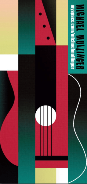
A big thing for me was a conversation I had with a friend of mine. We were at another friend’s gig he had just designed the leaflet for. It was basically a very simple drawing – a couple of circles and a line to suggest a guitar – but I really liked it.
I thought it was so simple but really beautiful and we started talking about cubism, about taking things away, how less is more and he suggested the Cartoon Modern book by Amid Amidi, which is the history of where modern art meets animation. I remember reading and looking through the book and seeing design in a completely different way than before. My drawings were a bit more realistic in terms of proportions, perspective and lighting. I started really thinking differently about it and so I decided that this was the way to go for this film.
The way the film started was that I wanted it to be really realistic and get across that this is quite a dull man – quite colourless and business like – but as soon as the baby arrives it introduces colour and different shapes. For example, in the typing sequence there are sorts of neon/very bright colours, then later on when she goes into the switchboard there’s even more colour and fun – I just wanted it to get more and more wild as the story unfolds.
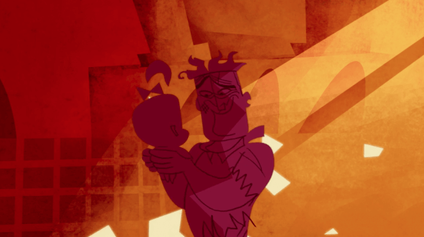
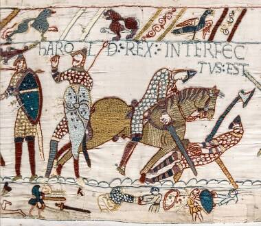
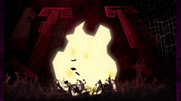
For the end sequence, myself, Daniel Permutt, who was the character designer, and Henry Lambourne, who was the production designer, went to the Victoria and Albert Museum and saw the wall paintings and tapestry to gather things for inspiration.
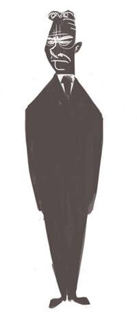
Also, when you look at the character design for Fredrick his hair, for instance, is influenced by pillars, which we would associate with business and trading and that kind of thing; And right at the end after Baby Betty has introduced all this colour and life into the film, even though she’s messed things up and she’s having all this fun, she’s actually in danger and there is a lot of red and a lot of sharp shapes and it gets very dangerous.
I also like jazz, which seems obvious when you listen to the soundtrack, but we took a lot of influence from ‘Toot Whistle Plonk and Boom (1953)’, which is a very musical film but also very simple, reiterating that ‘less is more’ attitude I was talking about earlier.
https://www.youtube.com/watch?v=zjHrmmFIErY
Everything is very well considered in term of design – it has all been carefully chosen. The biggest problem was actually having too many ideas about exploring this building! It was such a big building, you could have so much fun with it. The whole film was meant to be four minutes but it ended up being nearly nine! I don’t know how that happened (laughs).
The film follows the fictitious theory of how the Wall Street crash could have occurred, how did you decide on this narrative?
I liked the idea of fictional history and the other idea was ‘bring your baby to work’ day (I don’t know why that stuck in my head!), I was thinking about the scenario of bringing your baby to work for a day, mixed with fictional history; She could have caused any kind of chaos throughout time. It was my producer Sarah Senior who suggested the Wall Street Crash, which I thought was a really perfect idea, that it could have been caused in this really foolish way. It was perfect timing, what with the recession and all this talk about finances, money and jobs and looking at it in a humorous way – it was silly really.
At the end it’s less about the money, with a slightly cheesy ending, even though at the end when they hug and walk away all happy everything is still burning and everyone’s broke!
There was another potential story. At the NFTS you think of three stories, and it was between this film and another completely different film, but I thought this was the best time to make this film.
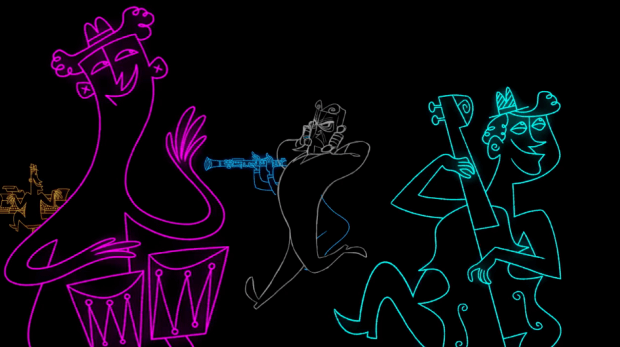
I particularly like the copy room jazz scene; can you tell us how that sequence came together?
The Typewriter by Leroy Anderson was a big inspiration in this scene. As you can see, he’s wearing the tux and everything and he pulls out this little typewriter and plays it like an instrument with a whole orchestra, it’s a very funny image.
https://www.youtube.com/watch?v=RlqDFPLUhig
So the scene works really well, visually. It’s also very different to how we started. Up to that point, everything was very loud and then it goes nice and quiet, gives you room to breath, but where they get all the instruments from I do not know (laughs). Baby Betty wants to liberate everyone! Everyone’s working so hard and are slaves to their jobs basically, and she comes along and sets all of them free, including Frederick. I wanted to keep that idea – that she’s setting people free as she comes into contact with them, because she’s fun.
The music in the film was also very much in keeping with up a style of the film, could you tell us a little about how you directed the musical score?
I worked with Jonathan Hill, who was the composer on the film; I had always wanted to make a really musical film. I’m always listening to music myself when I’m painting or drawing. I wanted to make a film that was like a classic cartoon – a lot of people refer to the film as retro, which it is.
I looked at a lot of old things for influences, but one important thing was music. A lot of the things I watched when I was younger were very musical like Tom and Jerry, which were very complicated in the way the music and the action swept together in the story. I never really had an opportunity like that before, as I had never had a budget before for this kind of film. Another thing at the film school was that you do get a small budget for your graduate film.
This film wouldn’t be the same without music; we wanted to take the audience on a rollercoaster. Like how the theme for Frederick is kind of comical although he takes himself really seriously, or at the end when everyone’s buying, it was kind of a last minute thing but I like the way that the sellers have gone tribal on the trading floor and the music works with those visuals, to emphasise that things have got out of control.
Also I think the end track is really clever – John said he wanted to have the end track with lyrics, he said it would be a bit like the Andrew Sisters and Lily Allen, with that kind of ‘poking fun lyric writing’, they’re making fun of the film. I didn’t hear anything until the very end, I had complete faith in him – and it worked!
I had never worked with a composer before, and it was nice to be able to explain “In this part of the track you need to feel unsafe, or curious” which is so broad, but I’d give him a few tracks and say what I was thinking about, then he would go away and come back with some things.
I remember the first track I heard, it was this lullaby where the very first note I heard I just laughed my head off, and said “This is it, we are speaking the same language”. It was great to work so closely with John, but he was also working with the sound designer to get the craziness of the experience in the film working together.
The film was produced at the National Film And Television School; can you tell us a little about your time there and how it affected your work? And how collaborative the process of making the film was?
There are only eight students per course, directing, producing, editing, composing etc. and in your first year you work within different projects with each discipline one by one (for example: you and the composer, then you and the sound editor and you get an idea of what they do). You may also have a personal project you want people to get involved with and experiment and make little things.
Then in the second year you are working with everyone in a production team. You get a small budget like I mentioned earlier, it’s not a lot but it helps you buy props, for example, or if you are making a stop-motion film it helps you make the set and puppets. So it opens up this experience; You’re not making this film by yourself, you get help from other people. It was such a great experience to have all these people involved, I personally worked very closely with everyone. It’s so valuable to see, as an animator you can be your own editor at your workplace but when you have a specific editor on board they will help you so much with the pacing of the film. It’s a great institute for learning how the industry works, without being in it yet.
I think that sums it up really, it’s like working in the industry without being in the industry. You have people telling you that in the industry you don’t have tutors advising you on things. Everyone has their own opinion on your work; People will have made things based on their own opinion and then a tutor will tell them it is wrong, yet it still turned out pretty good. It’s a very good film school and you do learn a lot. They also have master classes – our first one was Terry Gilliam so that was pretty unexpected.
The film has been screened across the globe, how do you feel about that? And what kind of reactions have you had to the film?
I went to a few of them – I went to the premiere in Annecy, and remember that throughout the week they had played it a few times but on the Friday it was on the big screen. But before that the composer had seen it on one of the smaller screens and he was freaking out because he was saying the music was too quiet. I was really scared and didn’t want to go in there and it not be what I wanted it to be, and people not have the experience I had hoped for.
I went in there, and I remember thinking ‘it’s a composer thing’ – they want people to listen and appreciate their music and rightly so. But the film went down really well and it was the last film of the week, and at Annecy the screenings are very late. It was about 11:30 at night and people do walk out because its getting late, but there were still a lot of people there.
It’s always quite nerve-racking; You’re never really watching it, but looking for the nearest exit (laughs). But it went down really well and I was very happy. The only other time before that was at the graduation show which went down really well too, but it’s different when you’re at a festival and people have said good things about it. I haven’t sent it to a lot of festivals, its hard to keep on track of these things – but it is stupid that I have spent so long making this film and didn’t send it out (laughs). I have put it online recently and it’s getting a really good response.
There was also a Cartoon Modern themed festival at KLIK! in Amsterdam earlier last year and the film was involved with that. It was great to be part of that with all these retro films – it also got a good response there, too. The more you watch it the easier it gets but the first time you watch it, like at Annecy, was terrifying honestly.
I’ve only been to a few festivals though, as it’s expensive to get there as well as submit your film to multiple festivals.
What have you been working on since completion of your NFTS course?
Since graduation I’ve been freelancing, working at studios and from home. I’m currently working on another film but because of the commissioned work I’ve had to put it on hold, I hope to get it ready for the New Year.
I still work very closely with Henry Lambourne who was a big part of the film, he did the backgrounds and a lot of the design work, we want to start making more things together because we had a lot of fun during the film, and if people like what we do, why not?
Can you tell us any more about your new film?
It’s set in the 80s and I think that’s all I want to say at the moment. It will be released soon enough!
You can watch Buy Buy Baby here or above and follow Gervais on his tumblr.


