Fraser MacLean: “Setting the Scene” Book Review and Interview
Right then, so you want to make an animation? Lets do a quick check list, you have your story? Check! You have your character designs? Check! You have your storyboards? Check! Okay so the scene is set, Lets go!
Hang on a second! What do you mean the scene is set? Obviously you have done plenty of research into character design and story planning because there are plenty of resources available, and how often do you hear the familiar chants “STORY is king” or “CHARACTERS must have appeal”?. Quite often I am guessing, they are important elements that must be correct if any animated film is going to be a success. What is often neglected though is the importance of layout. Layout and Background art quite literally blend into the background and as a result are not quite given the same attention as other elements that go into an animated film. You can buy books upon books about animating or pre-porduction artwork or stroyboarding or sculpting or modelling in CGI but when was the last time you can honesty say you took layout and background into serious consideration?
Step forward Fraser MacLean. Fraser has worked on productions such as “Who Framed Roger Rabbit” “Space Jam” and “Tarzan” as well as other productions for Disney and other clients. He has also passed on his gathered knowledge and taught at degree level. Armed with his 25 years of industry and teaching experience he has authored “Setting the Scene” a book that does the same for the art of layout that “The Illusion of Life” did for the art of animation. The book is a very thorough walk through the neglected avenues of layout and background art that takes in its history and evolution. Its refreshing to see a book giving so much attention to this subject as not many books have covered this subject in so much depth. The publication is presented in a style familiar to the many “Art of Pixar” books that the publisher Chronicle often release, but rather than a forward and then just pictures, this author delves deep into the world, history, mechanics and sometimes science of layout and as a result the book is as richly populated with information regarding the subject as it is with beautiful carefully selected production images and stills.
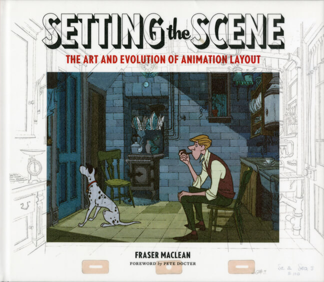
From the moment you have the book in your hands you get a clear understanding that you will be treated to an in depth look at layout. The fact that the books dust jacket almost serves as an animation cell with the background art making up the actual book cover gives you an instant understanding of what the reader is to expect, its a clever detailed touch that compliments the detail within the publication. The rich text comprises of interviews with some of the biggest names in animation such as Brad Bird, Don Bluth and John Musker as well as interviews with the family of animation legends that give a fantastic first hand overview of over a century of the craft. This book is not a practical “How to” guide, but after reading it you should be armed with a greater understanding of the craft and be able to use the knowledge and the inspiration gathered from the gorgeous images from the pens and pencils of some of animation histories finest to your advantage.
We were lucky enough to catch up with Fraser MacLean and talk to him about the creation of the book.

Congratulations on the book, When did you decide that animation layout would be a good format for a book?
The book wasn’t there! When I began being invited to teach on the various animation courses that had sprung up whilst I had been working in the industry, I felt that it was important for me to build up my own library of animation and movie, history and technique books so I could read and recommend a lot of books to students, because very often you don’t
have a lot of time with one groups of students or college. I felt that it was important for me to read those books myself so I could point the students in the right direction. There were some fantastic examples of layout artwork in the books but I could not find a book anywhere about how that developed and the crucial relationship between the animator and the camera. The more I looked and the more I could not find “that” book.
How would you narrow down the concept of Layout to an animation outsider?
I suppose if you had to condense it I would put it in the context of set design, early on in places like the Fleischer studios or Disneys “Alice comedies” a lot of the action was based on music hall and it didnt happen in a deep space. I would encourage people to think of it as set design with a mixture of cinematography when you think of what the cameras like the Disney and earlier Ub Iwerks multiplane could do, and later with digital cameras.
With layouts continuing evolution how difficult was it to structure the book?
The structure was a challenge. I gave up on imposing a set structure early on and decided the sensible thing was to ask the artists. What’s great is that Disneytoons arranged for me to have a meeting with the entire layout department. The same thing happened at Bluesky, they gave the layout department the entire morning off and set up a meeting for me. I handed over control and went to layout people and said “what do you want this book to say?” The way I approached it was letting the individual technicians tell me what problems they had and how they were solved. Then, where possible I would go to an archive or private collection and find artwork that, once put on the page would indicate how that sequence or scene came together.
You travelled to the Walt Disney Animation research Library and other archives when putting this book together what was that experience like?
I was fortunate because I worked for Disney on Tarzan in 1997 when we started as part of our induction we went to the ARL toured the Burbank studio lot. At that stage you would go to the library and meet the curators and see some of the artwork. it has since expanded and the work they do is extraordinary. I knew the story of layout could not be done without evidence of the process at Disney. I was very lucky that they were very enthusiastic and so supportive and that translated over to the Pixar archive as well. The wonderful thing about that and the interview process is that everyone I approached gave me someone else to talk to. The Chuck Jones centre for creativity were very welcoming and made original character layout drawings available, the same at Sony and the same at the University of Southern California were they have all the old Warner Bros, MGM Tom and Jerry and Tex Avery artwork. I was able to ride a wave of enthusiasm. Once people found out that “some idiot” was doing a book on layout people were so generous and so supportive.
Items mentioned in this article:


