Encounters 20/20: Part Three
This year at Encounters was not only my first time at this event, but also my first ever festival. As a wide-eyed animation student, I found the Watershed and made my way to the screening rooms but no one told me – not one of all these cool, talented people – that I didn’t belong; wearing my Encounters lanyard, they accepted me as one of their own! I met and talked to lots of people; filmmakers, students, animation enthusiasts and animation celebrities alike in the trendy Watershed café. The whole festival had this fantastic atmosphere of camaraderie; all these animators gathered, chatting about animation and encouraging each other in whatever their respective projects are.
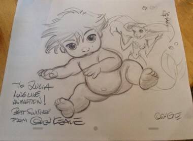
Friday morning had a particular kind of expectant excitement around it, as it was the morning of Glen Keane’s screening of Duet. We filed into the screening room, clutching our signed copies of a drawing of Mia – the girl in the film – and waited for the film to begin. Duet is the story of Mia and Tosh (and Tosh’s dog) and how they grow up, moving on their own paths, but also sometimes meeting and touching each other’s lives. Each frame of film is Keane’s original drawing – there was no clean up – and it is negative so that the lines shine white against a dark blue background, creating the feeling of the world being made of light. The music adds to that effect, almost shining itself.
The film is a feat of technology, made in conjunction with Google to be released as an app early next year. The premise is that your iPhone/tablet/Android will act as a window into this animated world and you can literally follow the characters, having to move around with your device to keep up with them. In his talk after the film, Keane joked about some of the obstacles that arose during the production. For a start, the programmers asked that he animate the film at 60fps because that would be “easier for them”! He showed us pictures of how the room that they were working in was laid out – programmers on one side, artists on the other – but explained to us that this was no great divide; Keane decided to teach the programmers life drawing and they tried to teach him some of the basics of programming, just so they could understand each other and work together better.
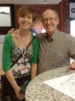 Surprisingly in his talk, Keane did not concentrate on talking about Duet, his production company or Google, but actually spent much of the time talking about his past and of Disney. He talked about his family and history for a while; how his father had been an artist and encouraged him in his art, about how CalArts accidentally enrolled him on their animation program instead of painting, and of how he came to be taught by the nine old men at Disney. He talked about how his portrayal of Ariel was based on his wife, Tarzan on his son and then brought it back to how Mia and Tosh are based on his grandchildren. He showed us a line test for ‘Part of Your World’ from the Little Mermaid, mentioning how he almost didn’t have her reach out at the end because he thought it would be ‘too corny’, and a clip from ‘Colours of the Wind’ from Pocahontas, saying how much he enjoyed animating in charcoal.
It was a shame that he had to rush a little through his talk because the next screening was due to start in that room, but Keane hung around for a long time afterwards in the café to answer our unending questions and sign and draw on everything that we pushed at him. All the while, he was patient with us and talked to each person individually as they came up, remaining humble despite our obvious admiration.
The afternoon of Friday was quite different from the morning. The first afternoon screening was called Animation 6: Strange Beauty and strange beauty it was; all abstract and experimental, very far from our Disney start to the day! The first film was Anomalies by Atsushi Wada, a film about faith and devotion. The animation was very minimal and mostly relied on sound to convey its point. We flicked between groups of people going about their tasks, while the sounds they were making started off as different but all became the same in the end. I would describe it as a weird film, but the point of spiritual connection came across fairly well.
The two main themes being touched upon during this screening were reality and love; both subjects that lend themselves to abstract, surreal and experimental animation. The main exception to these themes was Two Weeks – Two Minutes by Judith Poirier; a film created by printing directly onto 35mm celluloid using a letterpress. The synopsis says that the film is meant to ‘explore the double page format of the book’ but I felt that you needed this description to understand what was going on. The other exception to these themes was Re Place by Sven Windszus, a film that is a portrait of an Earth that has been inhabited by aliens. The filmmakers set up the world very well and you are left wanting to know what happens next; I felt that this short animation would work well as the establishing scene for a longer film.
Man on the Chair by Dahee Jeong was a beautiful film about a man contemplating his part in the universe. It could be very surreal at times, with moments like when he turns transparent and is filled with water as if he were a glass, but alongside the narration (English subtitles) the effect was very profound. The backgrounds were drawn and shaded in a light pencil and coloured in very neutral tones, making the environments calming while the man’s thoughts become more existential and frightening. The softness of the visuals made what could be a disturbing conversation about the state of our existence much more contemplative and interesting.
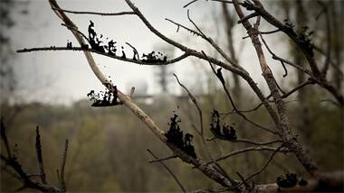
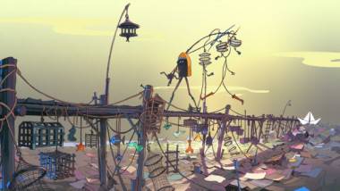
Back to the theme of love; Non-Euclidean Geometry by Skirmanta Jakaite and Solveiga Masteikate and UTÖ by David Buob dealt with the subject very well. Non-Euclidean Geometry particularly as it used mathematical theories to explain that love defies common logic in a very satisfying way. Paper World by Wojciech Ostrycharz seemed to be the film that linked the themes of love and reality; it is a journey through an innocent child’s imagination where anything can happen and the naivety and whimsy of it is lovely. There were then a series of films about the nature of reality; 5:48 – The Reality of Time by Thomas Gugel, Hunger (Glad) by Petra Zlonoga and Crow by Yoav Segal. Of these, I thought Crow to be the film that best expressed the theme. A dark reworking of the genesis story, the way that the images of the film grow and move make them feel alive, though they are completely abstract. The narration over the top adds to the unsettling feeling that this film inspires; I thought it was very well done.
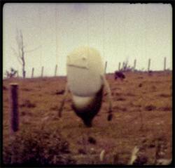
During the screening, the aspect ratio of the films were different, but I’m not sure what the projectionist must have thought of one of the next films; Migration by Fluorescent Hill, and it’s Instagram-esque squareness! In this film we meet an odd, 6ft tall bean-shaped creature as he crash-lands in an unknown town. Clearly lost and confused, he goes on a journey to find where he is meant to be. The old-timey filter over the top of the film gives the impression that our main character is on a grand adventure and, when he finds the rest of his kind, adds a reflective, nostalgic quality that stays with us for a while after the credits have finished rolling.
Dwarf Giant by Fabienne Giezendanner is the story of an Inuit lady remembering the first time she “caught a bird in the depths and stepped into the world of grown-ups”. It was one of the only films in this screening that I would say had a ‘traditional’ storyline; we have a heroine with a goal, a conflict and a resolution. The film has a charming aesthetic and the animation is beautiful. The idea is clever and the resolution is satisfying. Well worth a watch!
The last film of the screening was Wonder by Mirai Mizue. I thought it was an excellent place to finish; the film is an abstract animation that seems to simply be a joyful celebration of the medium of animation. Colourful, wild, fluid shapes move, collide and coalesce in wonderful ways with a synchronised soundtrack to create a psychedelic explosion that is really fun to watch.
The last animation screening of the festival was Animation 7: A Cure for the Curious. A good name for a category, its openness made for a varied and, well, curious screening that was an excellent end to the week for animation. One of the first films was Patch by Gerd Gockell, where someone paints little square canvases in slightly varying shades of colours and hangs them in a giant rectangle on a wall. The squares are then animated within that rectangle. The subtlety of the colours means that at first you only see the vague impression of shapes moving, but then the music picks up and the little animated squares become tiny animated squares – the ‘high definition’ version of the idea – and suddenly you can see… people…! …Elephants…! I found it to be an incredibly clever and subtle experimental animation that was magical to watch.
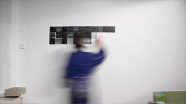
Patch (Dir. Gerd Gockell)
Though I was impressed with Patch, there were a few experimental films in this category that I felt missed the mark a little; Cruising by Zachary Zezima, Shell by Anna Lytton and BOX by Huizhu Yu. While you can vaguely feel a sense of the underlying message of the latter, the soundtrack was either almost silent or that loud, piercingly high note that is sometimes used to drive skulking teenagers away from shop doorways. The aesthetic of Josh Wedlake’s The North Sea Riviera inspired very little interest, with its off-white tones, very basic CG models and lack of music it was hard to feel for the characters or their stories. The film was too long at 12 minutes and dragged.
On a more positive note, next in the screening were two films shown one after the other that were brilliant; My Country by Ralph Stevenson and Jelena Sinik and Out of Bounds by Viktoria Piechowitz. My Country is an animated vision of Australia based around Dorothea Mackellar’s iconic poem of the same name, animated with a stained-glass look with beautiful, vivid colours shining out of the screen. The narration is passionate as stained-glass grasses grow, oceans move and mountains bake. Out of Bounds by contrast lacked this raw passion but was equally wonderful in its own quirky way. The film tells the story of Allan, whose Asperger phobias mean everything in his life, his house and his world must be in place. Dotted lines run around everywhere showing where he needs to walk and keep his things (most importantly his fishbowl with beloved fish Paul). The crisis arises when Paul’s fish food is delivered to his attractive neighbour’s house and Allan must brave the outside to get it back and save Paul from certain starvation. The film deals with Allan’s eccentricities in a very humorous way and I thought it a little gem.
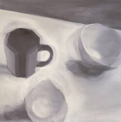
Terra Infirma (Dir. Betsy Dadd)
The Man Who Mistook His Wife For A Hat by Ross Hogg and Black Seed by Francesco Rosso are two films which, though animated in different media – charcoal on paper and oil paint on glass respectively – complemented one another; the first is about one man’s perception of reality through his neurological condition and the second is about one man alone in his cabin, trapped between reality and unreality. While the second was very dark and unnerving, the first was simply fascinating as the animation moved between what we see and what this man sees. The smudges left by the charcoal on the paper as we go from frame to frame leave an almost after-image effect so that the transitions between the viewpoints meld each state into the other. Later on another film appeared created using paint; Terra Infirma by Betsy Dadd. This film is essentially a still life painting in motion, if that makes sense! There is some sort of disturbance in the earth and so the items on the table – a bowl, a jug, a mug – all start to move. The movement is so subtle though, and the paint strokes make them seem so ethereal that they just seem alive.
An odd but somehow satisfying film in this screening was Fake Expectations by Adam Wells. The film is CG and the characters are little more than coloured stacks of 2D shapes with spines, but the simplicity of the characters means that more symbolic messages come through. The film seems almost Inception-esque as each character’s head is the shape of a picture frame and we move through picture frames and characters to find other picture frames and characters. We even begin with two characters in an art competition; one paints a blue frame and the other a red. The characters do act in a very human way though so we do get emotionally involved and understand their struggles. From what I could tell, the main underlying message was that material success is not as important as love, but I will have to watch it a couple more times to be utterly sure!
The next two films dealt with fate; The Sine Wave by Neely Goniodsky and The Shirley Temple by Daniela Sherer. The Sine Wave dealt with this in a rhythmic fashion, describing the inevitability of life’s ups and downs, over and over, down, up, down, up. The Shirley Temple is more emotional. A boy is swinging on a swing outside while his mother throws a party in the house. He has switched his mother’s gun from under her dresser for his toy one and has the real one himself, totally innocent of any intentions. He has inadvertently saved his mother’s life but a guest at the party forces him into adulthood. I shall say no more but the inevitability of the boy’s growing up is heartbreaking.
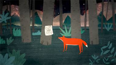
Symphony no. 42 (Dir. Réka Bucsi)
The last two films of the day were Tupilaq by Jakob Maqe and Symphony no. 42 by Réka Bucsi and they were in complete contrast to each other; the first discusses cultural alienation and abuse and the second is a comment on the irrational and sometimes ridiculous nature of life. Tupilaq, while a good film in its own right, acted as a wonderful springboard for Symphony no. 42 and the end of the animation screenings of the week. The contrast made Symphony no. 42 funnier and even more ridiculous than it maybe would have been otherwise. Even still, we left the screening room with smiles on our faces, satisfied with having seen such a range of good animation and with a fresh perspective on our crazy world!


