EIFF 2016: McLaren Award: New British Animation 1
Despite having a single short in competition at this years Annecy Festival, the UK has still managed to develop an impressive and varied crop of animated shorts this year. 21 of which, totaling nearly 3 hours, were split over two screenings at this year’s McLaren awards, selected and hosted by Iain Gardner.
Relationships were a recurring theme among a number of the shorts, although they varied tremendously. At both screenings, audience members were given voting slips and asked to vote on their first, second, and third choices for the award, with Simon’s Cat- Off to the Vet deservedly taking home the award.
Dave
Dir. Garry Mashall, Chris Watson
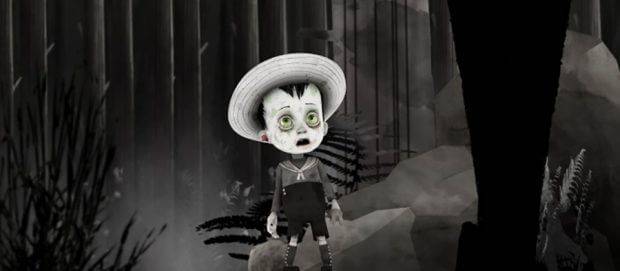
First up and having it’s first screening, was Dave. A distinct-looking short about a zombie little boy who, after losing his desolate home and parents’ corpses, explores the world of the living. Co-directed by Chris Watson and Garry J. Marshall, and produced in Scotland via the Scottish Film Talent Network, the film plays some creepy scenes against morbid humour and sight gags. The technique is a mix of 3D CG characters with stylised 2D Digitally painted backgrounds, with colour used sparingly. If the film had any shortcomings, I felt that the character animation was a little weak and floaty. During the Q&A it was mentioned that the character animation was mostly motion captured, which explains that.
Fishwitch
Dir.Adrienne Dowling

The first of a number of NFTS shorts. RCA and ECA were the only other schools represented, which is unfortunate because there have been some great animated shorts from different schools around the UK this year. Anyway, this screening was also the premiere of this wonderful and funny stop motion short, in which a well-meaning Merman(a cuter ‘Creature from the Black Lagoon look-alike) attempts to befriend a withdrawn witch, who has isolated herself in her iceberg home. With one setting and only the two characters, the focus is on how the characters interact and how they feel about one another, which is exactly what I like to see.
Rain or Shine
Dir.Felix Massie
Created by Nexus Productions in London, it was actually a linear theatrical version of what will be a 360 non-linear short as part of the ‘Google Spotlight’ series, which will be available later in July. The premise is simple- a little girl’s sunglasses cause rain when she wears them. The 360 version is created in such a way that the viewer can look around the square at any time without missing anything. With no cuts, the viewer is guided through the square as if on a monorail. Heavily stylised and graphic design gives this film a really sweet and fun feel, and makes the camera movement seem even cooler.
The Wrong End of the Stick
Dir.Terri Matthews
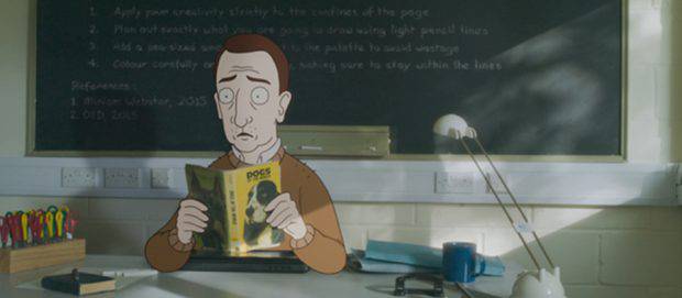
Unsettling and graphic, but terribly funny was The Wrong End of the Stick, another NFTS film. What starts as a quirk develops into an otherkin identity crisis that doesn’t go down well with the middle-aged subject’s wife. Director Terri Matthews really knew how to make the audience uncomfortable from our own perspective, as well as that of Malcolm and his wife. The film uses digital traditional animation with live action settings and props, and does so more competently than you might expect from a student film.
Neck and Neck
Dir.Shaun Clark
The first of two Shakespeare adaptations from Mew Lab, Neck and Neck is based on Othello. Director Shaun Clark adapts Shakespeare’s imagery of the neck as a sensual, but vulnerable part of the body as a barometer for Othello and Desmonda. I’m not normally a fan of this style of drawing and animation, but in this case it made sense to move away from more tangible styles, or else the long necks might have looked grotesque, and the surreal animation might have been harder to get on board with.
Illusions
Dir.Dominica Harrison
Illusions, a student film from ECA, uses a completely unique animation technique. I believe the animation started as digital traditional animation, but after that, it was split into duotone colour separations, and screen printed in real ink onto paper sheets, and from there it was shot as if it were stop-motion. To be honest, I think the look of the film cost the storytelling. I can’t remember what it was about, other than an out-of-body experience. I liked seeing something that looks completely new, but I felt the technique actually hindered my involvement as an audience member.
Simon’s Cat – Off to the Vet
Dir.Simon Tofield

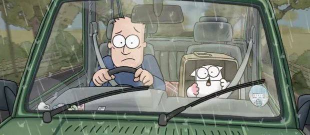
With the help of a crowdfunding campaign, Simon’s Cat has expanded into a 13-minute colour short film, on top of the popular YouTube series. Despite the longer format and more developed artwork, it still retains the simple charm of the series. They must have been very deliberate about how far to push it.
I was particularly impressed by a single shot that lasted a few minutes, and just kept delivering joke after joke, in the series’ familiar non-dialogue style with a super simple setup- the cat doesn’t want to go in the box.
A fantastic effort from all involved, the film was the audience’s favourite and won the award. Yet another lesson in simplicity. The film probably had the highest, and some would say more traditional budget, at just over £300,000, and clearly that money was put to use increasing the quality of the cartoon itself.
Stockholm 6
Dir.Magnus Lenneskog
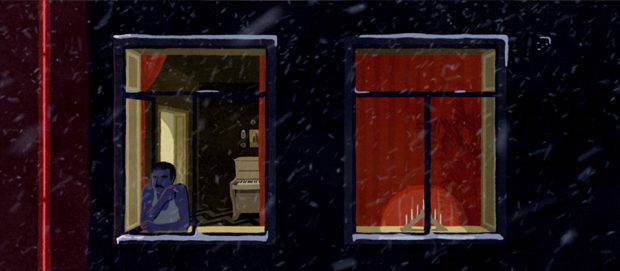
Another RCA student film followed, Stockholm 6 by Magnus Lenneskog. Inspired by his real life experience as a postman, wondering what was behind the thousands of doors he visited, the film strings together vignettes from various flats in an apartment block, as they are visited by a postman. Each visit varies on the theme of longing. The animation is digital, semi-lineless in style, and appeared to be partially rotoscoped, as far as I could tell. Great design and colour palettes help connect and separate the different vignettes as per the director’s control.
The Inverted Peak
Dir. Myles McLeod, Greg McLeod, Tom Angell
The Brothers McLeod have been nominated in this category before, and they are back again this year with a new short. This scratchy visualisation of the subconscious visits and revisits some of the weirder parts of the mind, repeatedly asking of each one “who’s in control?”
Isabella
Dir.Ross Hogg, Duncan Cowles
Isabella, by Ross Hogg and Duncan Cowles, closed the first screening. The film is mostly real footage of a 92 year-old woman, suffering from a deteriorating memory, as she recounts a story from her school days. There are splashes of abstract animation throughout, and the live action action video goes through various effects as the memories themselves lose clarity. There was very little animation in it, so it seemed a bit out place in this branch of the festival but it was a lovely portrait.
The second batch of shorts, shown the following day, displayed just as broad a variety of content and style, proving that British animation is still very much alive and well. Join us for part two tomorrow.


