DreamWorks Animation: The Exhibition at the Australia Centre for the Moving Image
I am first to admit that I’m not a huge DreamWorks fan, unless your talking Aardman’s collaboration (maybe I’m being biased), but to be fair Chicken Run (2000) was a belter. I never really got Shrek, but was turned a little by How to Train Your Dragon (2010) and my sister is slightly obsessed with Kung Fu Panda (2008). But what I do love is anything and everything related to the art of animation. So I jumped on the tram and headed to DreamWorks Animation: The Exhibition, currently at ACMI, Melbourne. The only time I could visit was during the school holidays and as I joined the long queue of excited little people, I nearly turned around.
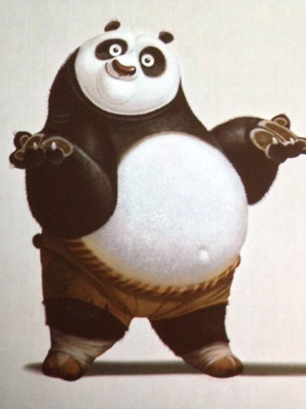
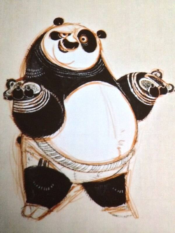
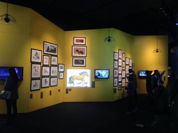
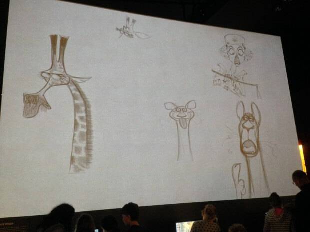
The exhibition itself is underground and as you climb down the stairs animated sequences run up and down walls – caution needed as the little people freaked out! The premise of the exhibition is Character, Story and World from 1998 to 2014. Descending to the entrance I have to admit the excitement and energy of the little people became infectious. Once coats were yanked off (it’s winter here) and thrown in the direction of those pesky elders, it was like a scene from The Hunger Game,s as hoards of kids legged it into the depths of the exhibition. I had to stop myself from running with them as my adrenaline was at theme park status. Instead I stood in front of a floor to ceiling screen, projecting looped stages of character development.
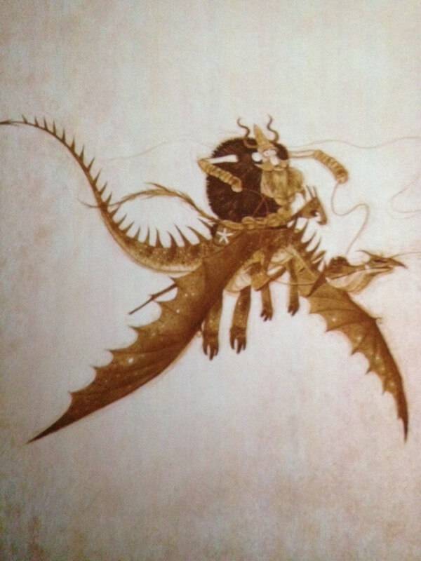
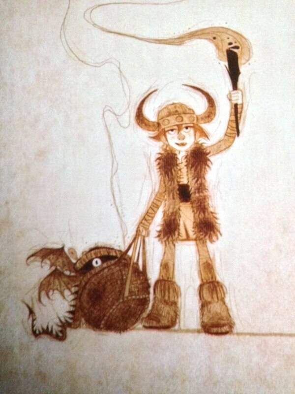
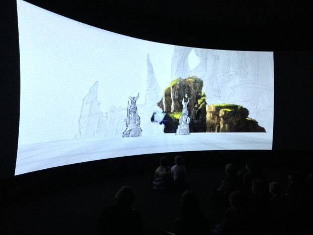
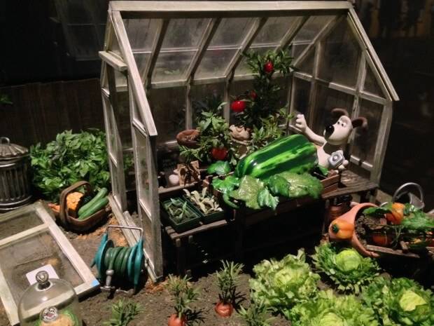
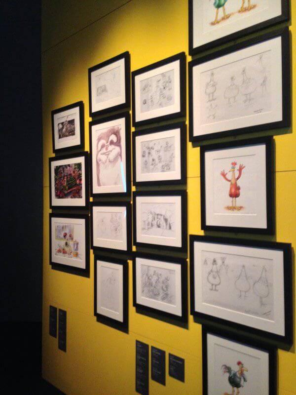
It was great to see my old friend Gromit and a set piece from Curse of the Were-Rabbit (2005) and Chicken Run puppets. I got to experience the 180-degree screening of How to Train Your Dragon. It starts from a scripted scene, to a sketch, animatic, digital, environment and sound concluding with a dragon in full flight. Exiting the screening a parent collared their kid, who looked like they might burst. Grabbing both shoulders, looking directly in the kids eyes she slowly said ‘you’ve got to calm down’ before letting him go. He ran (of course he did) shouting, waving his arms in the air ‘dragons, again, dragons’. She turned to me ‘third time’. I laughed. I wasn’t sure if I was supposed to?
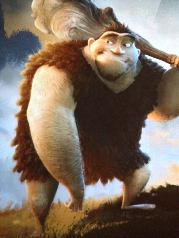
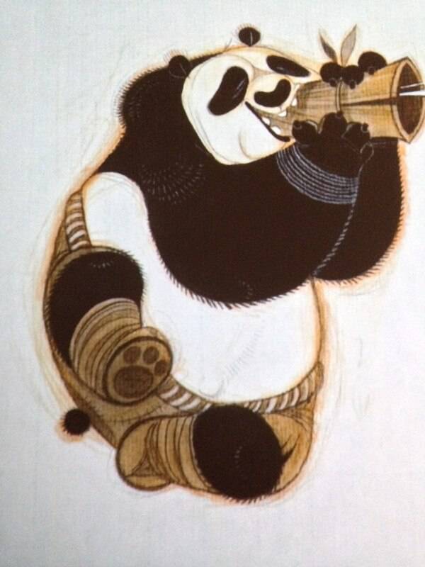
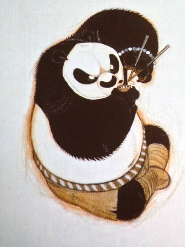
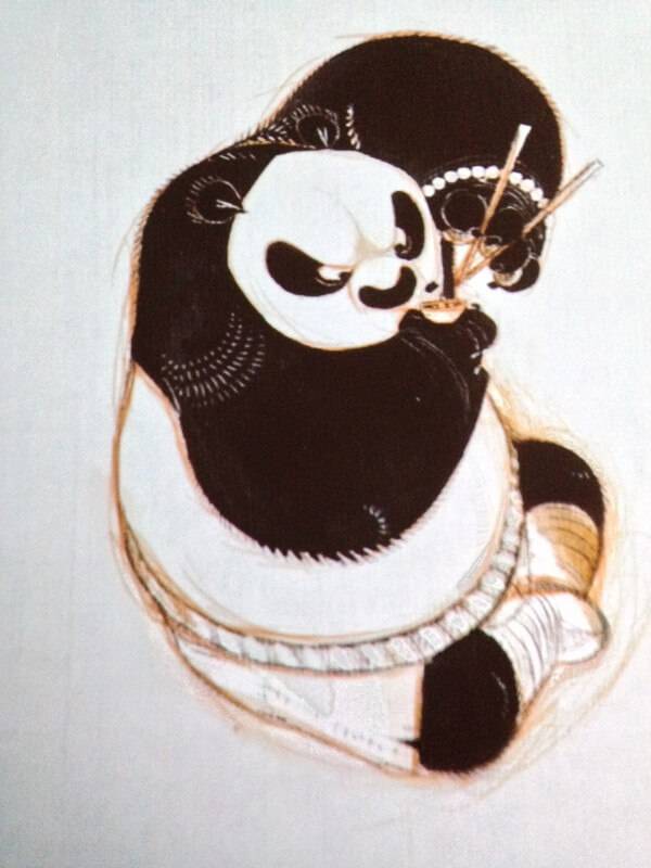
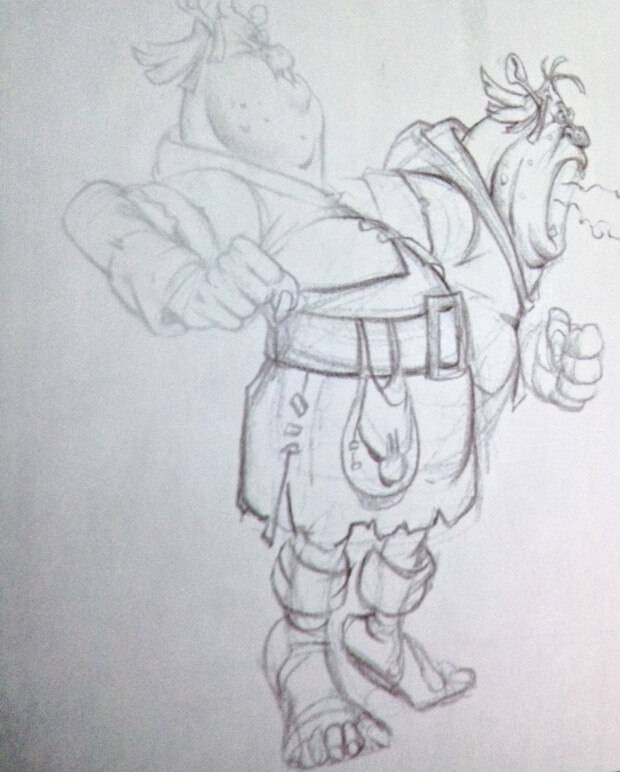
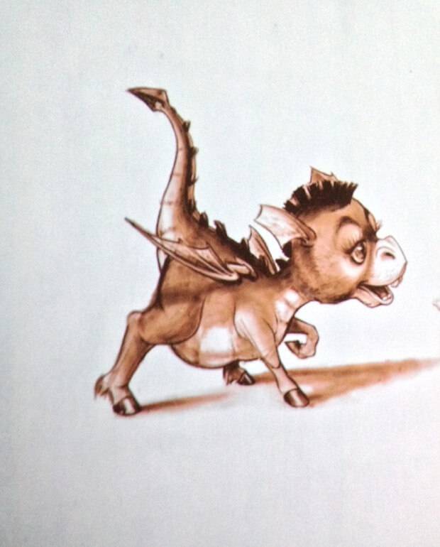
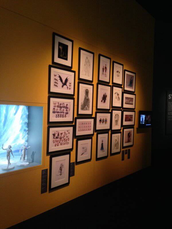
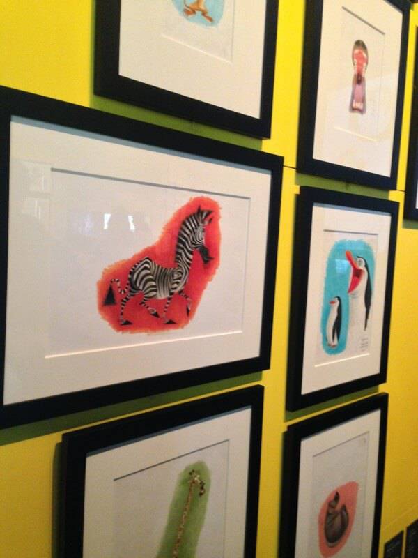
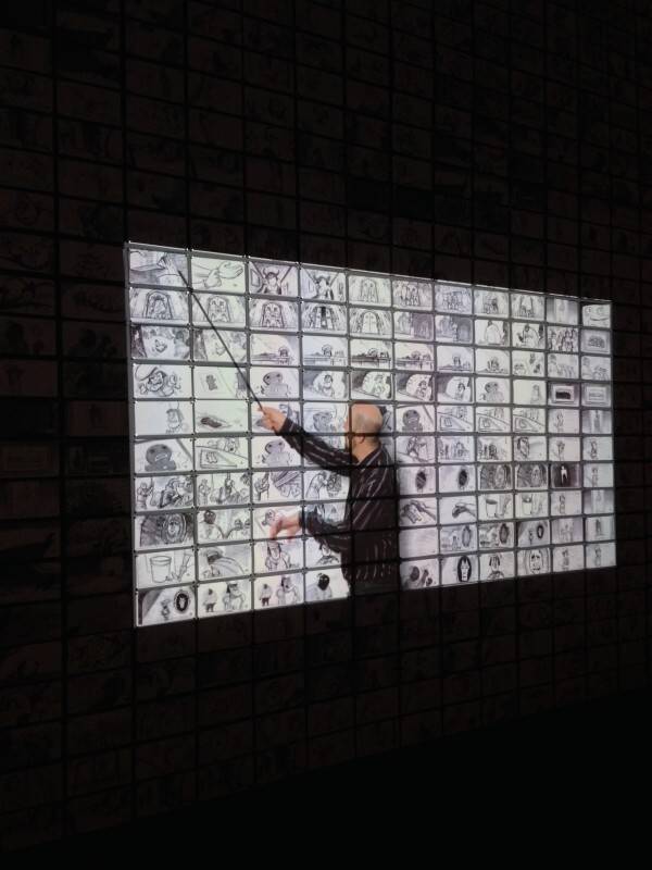
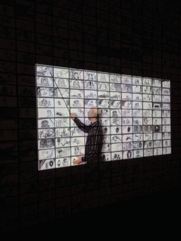
I walked round the exhibition twice and there is some really beautiful artwork to squash your nose against and admire. I found myself standing still for some time looking at Patrick Hanenberger’s digital concept artwork for Rise of the Guardians (2012). Projected over a wall of storyboards they screened actual pitch footage from Shrek – very funny. Part of the exhibition included stacks of storyboards, from the floor up, illustrating the amount needed for a feature film. While I was reading the information card a kid ran up next to me, quickly glanced at the towers of hard graft, and casually said ‘boring’ before running off, probably to see more dragons. I did agree with him about storyboards – interesting to look at, boring to do (my opinion – you may love it).
Aside from the artwork there were plenty of interactive activities, which included animating in the DreamWorks style. Two exhibition pieces included a production designer and storyboard artists workstations with projected moving images giving an insight in the practice of those roles. There was a fair amount of artwork, some placed high up on the walls, which restricted some viewing. Also the reflection of the lights spoilt some works. Having said that I could have easily spent a good few hours pottering around, and it has made me want to watch the films.
From a marketing perspective that’s probably one of the exhibitions objectives ticked. ACMI’s gift shop was crammed with DreamWorks memorabilia. I flicked through the exhibition book and couldn’t leave it behind. I’m not sure if the book will go out on general release, but it’s a chunk of a book – 323 pages of back-to-back illustrations. Drinking a strong cup of English tea in the ACMI café (seems sacrilege as Melbourne is famous for its fantastic coffee) but my adrenaline was already pumped – I can look back and say I survived the DreamWorks exhibition during the kid’s school holidays! In-fact, it was a lot of fun. Getting up close and personal with some beautiful original works supports the importance of the preservation of animation, which thankfully most of the major studios can afford to undertake. We need to keep ‘the art of’ our blue pencil, clay fingerprinted industry. It’s just too fabulous to chuck in a skip. If you need clarification just ask the little people – if you can catch them.


