Interview with Disney’s ‘Feast’ creators Patrick Osborne, Kristina Reed and Jeff Turley
At this year’s Annecy Animation Festival, Skwigly had the pleasure of being amongst those privileged enough to see the new Disney short film Feast at its international debut screening. The original short is to be screened before Disney’s upcoming feature Big Hero 6.
The film documents in beautiful detail a love story between man and woman, dog and food and the interwoven compassion that binds them. Expanding on the groundbreaking technology created for Paperman, this new short film is a feast for the eyes as well as the heart.
Skwigly sat down to discuss narrative, technology and food with first-time director Patrick Osborne (head of animation, Paperman), seasoned producer Kristina Reed (Big Hero 6, Paperman) and production designer Jeff Turley (Paperman).
 Can you tell us a little about the internal ‘Short pitches’ drive within the Disney studio the film came from?
Patrick: Disney opened the idea of short pitches about a year and half ago – basically anyone in the animation studio can pitch story ideas to development, and then move on to the Story Trust and then move on to John Lasseter. It’s an amazing opportunity for artists, in a studio like Disney, to get their ideas out there and potentially make something! It proved very popular, a lot of people came forward. It’s great to be part of a company where that opportunity exists.
Can you tell us a little about the original idea and where it came from?
Patrick: In the middle of the project I decided to dig out my old sketchbooks to figure out were it had come from as it been sitting in my head for a while. It was a sketchbook in 2006 with a list of dinners in it, which go from a single guy’s dinner, to impressing someone on a first date, through the simple dinners of comfortable dating, what romantic meals are like or the break up meal is. Just the idea that you could tell a life story just through the plates, I thought maybe it would be a live-action thing, or an illustration project, but you never know what any idea will turn out like. So they go on a list I have, a note taking app on my phone of potential ideas I could use in the future. When the option to pitch comes up you think if there was a dog in that meal thing it could be interesting. Then I played with a video app, recording a second a day with that idea in mind and it sort of cemented that maybe there was something there, in telling the story through quick edits, and it kinds of developed organically from there into what you see now.
On that note, the imagery created for the film is absolutely beautiful, what sort of research went into development?
Jeff: One of the first things I did was talk to a food stylist about how they design food, what makes food interesting and delicious. They said to position it for the shot, to make the design aesthetically pleasing for the camera, and that natural light was important for the food; If it is in dingy light it gives the impression that food isn’t edible. Another thing was to make sure the ingredients were really recognisable and separate, that was a really surprising thing that they do. They take tweezers and organise pieces of a hamburger, and move things if you can’t see them and are meticulous about how you see food, that’s what makes you drool.
So that was important, also the research of lighting, really great photography, cinematography, videography. We made sure that we only put the things that complimented each other – lens effects, dots, graphic shapes that can be overlaid in the image. The feeling of light was important for the story; We wanted to make sure we tied the emotional appeal of a certain type of lighting to the story.
Cinematography did play a very important part in the film could you explain the thought process behind this?
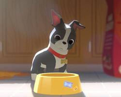
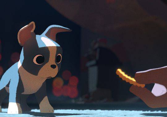
Patrick: We wanted to tell a story with the cinematography a little bit. You want to tell story with everything you have, so you figure out what your arc is going to be and then think how to make the camera and the lighting tell the story. The camera is locked down for most of the short and it’s only unlocked when he (Winston) acts a little above what a dog’s station should be. We made rules that lighting represents his views of the food, and the camera represents the movie’s ‘magic’. With the light, if it’s good food it’s in light, if it’s bad food it’s in shadow, you have all these tricks so you might as well use them to extenuate the movie as much as possible and get people to feel it in ways that aren’t exactly obvious to the audience but they can be brought along emotionally. I love crazy cameras, so it was hard to be disciplined to say “No, the camera’s not going to move at all until it needs to”, but I think it pays off. When it does move it’s way more fun then the rest of the camera work. I’m glad people notice that stuff, as it should be subconscious a little bit but it’s fun that’s it’s recognised.

Image: Disney (via USA Today)
The short uses similar techniques as that of Paperman, but creates a very different look could you tell us what makes them different?
Patrick: As an artist, when you’re evolving you tend to keep things you think are working and get rid of things you’ve done before. This is what we’ve done, there are things that worked really well on Paperman and there’s no reason to get rid of that, but there’s also a different story to tell, and you have to understand what the story is first and what the intentions are of the story. So once I understood where we were going with it, I knew what we had to add to it, and what we kept from Paperman was the flatness we all like. It’s about simplicity in telling a story which we really appreciated in Paperman. What we added to this film was the video aspect, the shallow depth of field…
Kristina: Colour!
Patrick: – And also using colour! As an emotional tool. Food is very important and understanding what those colours are and being very specific about that was something we were able to use to tell the story.
As an artist, you have these sets of tools and you try to use everything you have to make this particular image. For us, the goal of the image is more important than whatever technique gets us there, and the technique is just “How can we create this amazing visual we’re trying to make with the people we have here and the time we have?”. We had the Paperman tools available and we used them when needed but the design of the world is a lot more shape-driven and less line-driven. We didn’t need it nearly as much to make the image look finished, it was just about making the image look beautiful. I think the techniques we were using in both shorts are very good at being strong with your visual language in every shot.Jeff: There was a moment were Josh, our special effects supervisor, said “Come over to my office”, and he had taken all the colour out of the film! It was awesome to watch, it was amazing how close the values looked to Paperman! There is something that we learned from that: You force yourself when you work in black and white to be very conscious of value and structure of things, it really adds to the film. So once you add colour it becomes all that more pleasing and appealing. It was interesting to see that, he was like “It’s like Paperman but for dogs”!
How was the experience as a first time director for you (Patrick)?
Patrick: It was a dream! To be able to see something from an idea that was never really solid, to getting so many great artists to come and help finish it is really great. It’s really hard to clarify things to yourself in your head or on paper, but with all our combined skills it was way better than any individual, so that privilege is never lost on you at all during production. I got to animate on it too, so I got to ask, “Is this good? Does this fit in?”
After the whole process, each part is really fun in its own way. It’s a neat process because nothing ever gets boring, everything’s different all the time. It’s pretty great to work with friends and people I’ve worked with before that I know I trust and will get a great result. It would be nerve-wracking if that support wasn’t there, I’d get very nervous.
And for you Kristina, how was it overseeing production on Feast?
Kristina: Well, I’ve worked with Jeff and Patrick for quite a few years now, in lots of different roles. It was a joy to see them take their art to a new evolutional level. It’s always a pleasure to work with creatives you trust, as you don’t have to stand over them wondering how things are going to shape out, you can just handle all the other things they should be worrying about. So it was just fantastic and I’m grateful to them for bringing me back to Annecy again!

Image: Disney (via USA Today)
Jeff: even on Paperman Kristina was always as cool as a cucumber. When she was taking a chance on us she was able to manage the team in such a calm way, which is a real asset to the team to have the support that you need but also someone calm enough to let you make the mistakes. It’s really helpful.
Feast (along with Big Hero 6) is scheduled for a Stateside release November 7th 2014 , with a January 30th 2015 UK release to follow.


