Interview with ‘Snowfall’ director Conor Whelan
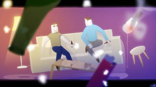
Among the animated short films that have particularly shone this year is Snowfall by Conor Whelan, a touching story of the inspiring beauty of the city combined with that moment of connection we can feel between ourselves and others, however fleeting. This highly graphic and subtly sensitive film draws attention to itself as a perfect representation of everything short form films can be.
This film has no fat to trim or aimless moments of ponderous ‘what-if?’s; it does what it should, telling the story of a spark, a moment, leaving the audience satisfied without outstaying its welcome. Recently we managed to have a nice chat with Conor as he sat outside the history museum in Ireland.
To begin with, can you tell our readers a bit about who you are, your animation background and what you are currently working on?
I studied visual communication in Ireland. I got into animation at the end of my course through motion graphics and chose to do my final project as a motion graphics project. It was version of the Jumanji ending credits that, looking back at it now, was terrible, but it taught me a lot about timing. I graduated from college in 2012 and started getting more into narrative animation. Snowfall was my first short film, but I’ve made a few tests and super shorts as well. I now work in advertising and animation for commercials as my day job to fund my personal work such as short film and character animation, which is something I’m very passionate about. At the moment I’m working on a new short – it’s not really about storytelling, it’s more an opportunity to try a new visual style for me. After working on one project for so long I find I want to experiment more.
How did your recent film Snowfall come about?
I’d been doing lots of smaller projects and I wanted to work on something a little more substantial, so I decided a short film would be the right way to do that. The idea for Snowfall had been drifting around my head for a while.
What inspired the narrative of the film?
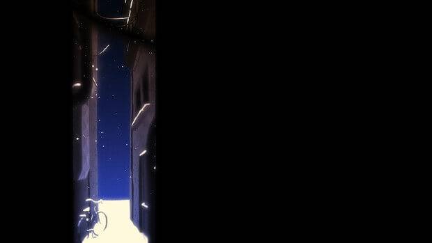
I was inspired by a trip to Amsterdam, when I was doing an internship just after I finished college. I was there for about four months and just fell in love with the city. It’s very intimate, especially when it snows, and just from the experience of being there (it was my first time away from home) it was a very important time in my life.
I was working on the film in evenings and my free time, so it took a while, but when you’ve been working on something for about two months it’s too late to stop and that in itself is a good thing as it’s self-motivating. It took about a year in the end.
There are some truly wonderful animated moments in the film; can you tell us a bit about where you draw reference/inspiration from visually?
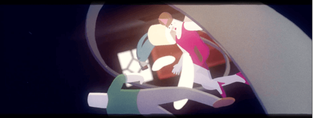
Thank you very much. One of my main motivations for creating the film was that for a long time I’ve wanted to do a really long shot, which is in the second half of the film, in the floating scene. That was the whole reason I wanted to make the film, really. There are so many long shots in film that have inspired me, like in Tarantino films where cameras seem to fly all over the place and don’t seem to have any physical rig. Of course, in animation you can get away with a lot more of that. I love those moments in film where everything seems to stop still, they’re really provocative and convey emotion in a very simple but powerful way.
As you mentioned you work a lot with motion graphics, how do you feel this has affected your film style and structure?
Having come from a visual communication background I think I approach things a lot more graphically in terms of composition. In Snowfall there are a lot vignettes and apertures to frame scenes in a certain way. I think studying visual communication gave me an appreciation for white space and how to use it. It’s really interesting to have the majority of the scene be empty, with perhaps just one interesting thing happening in one area of the frame. It draws in more attention that way. Within Snowfall, the floating parts of the character make use of motion graphics techniques that are used often but rendered in a more traditional animation way.
You have a very strong eye for design, how have you developed this during your career?
Just knowing less is more – the temptation would be to put things front and center in frame but when I’m looking at a film and I see little details I appreciate them more because I’ve found them. It’s giving the audience the ability to figure things out for themselves. I think I’m still trying to figure out ‘my’ style, I’m still experimental so it’s hard to know where it’s come from or were it’s going. I really love hard graphical elements, but mixed with realistic optical things such as light, shadow and depth of field.
Could you tell us a little about your Weekly Walks project, and why you decided to do it?
Once again, this was just a bit of fun with a short project. Often when I’m starting a big project I won’t take that many risks as I’m going to be working on it for a long time, so you worry it may not pay off. With Weekly Walks I just set myself the goal to do a new walk cycle very week, firstly to just get better at walk cycles and animating but also for the opportunity to try out different styles, and if it didn’t work out then there was no bother. My favorite one changes quite often, but it’s probably the girl in the pink dress or the postman. So now I feel that when I do a walk cycle in After Effects I can get to it really quick. I should do this with other things like facial expressions, but it doesn’t have quite the same feel.
Do you mostly work in After Effects?
Mostly. But most of Snowfall was done in TVPaint, then comped together in After Effects. TVPaint I mostly used for the basic frame-by-frame work, it’s a lot more intuitive and freeing. You don’t have to worry about anchor points or what the last frame’s going to do.
I also really loved your film for the ICAD awards, how did you come up with entomology theme?
I did that with a production company I worked for called Piranha Bar with their Creative Director Richard Chaney and the writer Darragh Carey. I thought bugs would be fun as they’re nice to animate and there’s so much variety, so I made the client a big slug and the animator these annoying little flies. I also wanted to mix these 3D and 2D elements. I like the visual language of the entomology theme. We do these every year, they’re an opportunity to show off our creativity abilities and styles. For example, last year Richard Chaney did a dynamic, live-action piece. They’re always quite different and it’s an open brief, so they’re always fun to do.
https://vimeo.com/96818896
Did you feel any sequences in Snowfall pushed you, either technically or narratively?
Definitely that long, flying shot was really challenging. It was one of those shots I left to the very end and for the ten months before it I was thinking How am I going to do this shot? I ended up doing a pre-vis in Cinema 4D just to get the camera movements right and put placeholders of where the people would be. Then from there I took it into TVPaint, got the main characters blocked out, then into After Effects to do all the composting, particles and lighting. It was kind of like doing the whole pipeline but by myself. It was challenging but I feel really pleased with how it came out and I feel a lot more confident with those sorts of shots. This was my first serious attempt at cel animation, so there are still shots in there that I worked on first that are a bit dodgy in comparison to the end, as I learned as I went along. Narratively it’s always hard to structure and make decisions on framing shots, but I really loved the process. After you’ve made the animatic and you go back in and figure out what shots are absolutely crucial and the others you cut it’s really liberating, as you’re left with a condensed story that only has the most important elements.
Can you tell us any more about your next film?
It’s just a bit of fun, I probably wont be submitting it to festivals as its using a copyrighted track from the sixties. I say a bit of fun, but it’s actually about a serious story of a woman in abusive relationship but fiction it not like a thriller or drama. It’s going to be set in LA.
But it’s really more of a stylistic experiment. I’m just attracted to those clichés and tropes in films, sometimes I will deliberately make a trope shot as a reference to American films. The kind of fake glamour of the sixties, such as the advertisements of the time that made everything look wonderful when really there was a lot wrong (such as civil rights issues), I find that juxtaposition really interesting. ‘Plastic, happy America’ versus reality. One day I’d love to do one of those nuclear safety videos. There are so many out there online, and you would swear they were tongue-in-cheek but you know they were serious.
For more on the work of Conor Whelan visit conorwhelandesign.com


