How To Come Up With Great Story Ideas In Animation
At some point we have all come up against it. The mental block. That creative black-hole out of which no ideas ever leap. It’s a frustrating place to be, and the more frustrated we become the harder it can be to get an idea out and on to paper. The solution is to come up with as many ideas as possible. But that isn’t a contradiction. Not all your ideas will be brilliant and some will be just downright awful. But some will shine. The trick is to create, create and create again. The more you do it the more you will get in to the flow and the less conscious you will be of the whole process. Coming up with an idea for a film that sustains your interest and commitment to a project can be a taxing problem for many animators. After all you could well be working on the idea for many months, if not years, so it better be good! You also want your audience to engage with it too so your idea needs to please you as well as everyone else, in an ideal world. If you have a short deadline with a project, if for instance you had to develop an idea as part of your studies or for a competition then there are some things that you can try to help those ideas to flow.7
Why not try taking some inspiration with these simple starting points. Pick a word at random. Take a dictionary and pick a page, a column and then a line number. On page 748 of the Oxford Dictionary of English in column 2 and line 10 I found the word ‘hallucinate’. So that can be the start point for an idea, a film about warped perception, nightmares, delusions or visions perhaps? Surely plenty of material in that one! You can try the same thing with shapes and colours too. Pick a colour or shape and take these as a source of inspiration considering what things they trigger. Maybe you’ll want to work with a thesaurus as well so that you get a wide range of associated words from which to build a firmer base for an idea. Taking the word ‘circle’ think about what this means to you. A ring? A hole? Being surrounded? An endless cycle, or just a simple trip on the Underground (Circle Line)? Maybe you can think about then combining all of these. So from a simple starting point, a circle, you could soon end up with an idea based on a character riding the Circle Line, surrounded by strangers, overwhelmed and feeling surrounded. But the line is a Moebius loop (an endless strip) and it’s the character’s struggle to break out of the loop and away from the encroaching strangers, to find a hole to fall through and end up back at the beginning so that the narrative becomes circular too. A little clichéd perhaps, but you get the idea.
You might also look at using existing text, from a newspaper article or headline, a poem or even a short story. The beauty of working with text from a newspaper article is that a lot of the development work, in the sense of characters or narrative, has already been done for you. You might not take the whole article and just use a line or two as a starting point, that’s up to you. And that’s the same for a poem or short story. Grant Orchard’s ‘A Morning Stroll’ was inspired by an existing text. But I want to look at that in more detail late as I think that it proves a point that it doesn’t matter what you use as your start point. What is crucial is that you bring your own personality to the narrative in the same way that you bring it to your characters and the way that you make them move.
Perhaps a way to think of generating film ideas is that it’s the way to find a simple starting point. Think of it like a précis. At the heart of any film’s idea is a simple core. ‘Peter Pan’ is a story about a boy who never grew up, ‘Madagascar’ is simply three animals stuck on a desert island. It’s adding the detail, the distractions, sub-plots, obstacles and resolutions that take the time but don’t get bogged down in trying to do this at the start.
Rambling storyline? Skip to the end!
A common problem that I have observed when people begin to develop their first narratives is that the storyline rambles on with no clear end in sight. Now you can avoid this right from the start. Once you have the seed of your idea clear in your mind then you should move on and skip to the end.
Make sure that you clearly define that start of your film idea – this is the seed. It could also be the inciting incident, the action that puts all the other events into motion. But once you have this in mind then move to defining the end of your film. That way you have constrained the idea top and tail. You know where you’re starting and you know where you’re ending up. Don’t try and write your narrative like you would write a letter. No screenwriters sit down at a keyboard and work through the script in a straightforward way, the script develops over time.
So once that you have the two definitive points identified, the beginning and the end, it will be easier for you to pepper a time-line with the events that you need in a much more logical fashion. This way of working also means that you can jump around and work on different sections developing one, then leaving it to work on another, working in a bit more of an organic way. Of course you will need to edit this once you think it’s finished, and maybe move a scene or two around so that the script flows better but at least you know that you have a sound working structure that heads to a logical end point. Try if you can to work with the classic three act structure – with the beginning, middle and end. You might want to explore some other structures though. Research ‘The Sequence Approach’ where you have a number, usually eight short sequences all with their own three-act structure, ‘Non-linear’ (present, past, present) or the ‘Syd Field Paradigm’ where the film has critical plot and pinch points, with usually 10 major structural elements within the film. If you want to play around with different structures then I would recommend finding examples that use the particular structure that you want to use and study them. Look at how and when elements that are crucial to our understanding of events, locations or characters are revealed.
Look over there, there and there!
The design of your work will be one of the major strengths or weaknesses of your film. Now whether it works or doesn’t will come down to how well you have researched and developed the idea. I would suggest looking at as many different perspectives as possible from a range that sits within the genre that your proposed film is situated. Thanks to the success and increased complexity of the design of games their influence is gaining momentum in the design of other work. Drawing inspiration from games is fine as the art-direction in them is now as strong as that of many feature films. However don’t make that your one and only stopping off point. Do your research. With many artists now having websites or blogs it’s easy to do your research on them. When you see something you like then find out who made it. Look them up and see what they have said about their journey in creating it. Take a look at what they were looking at. Often you will find that an artist will not just have looked at one source to arrive at their final outcome. For instance they may have taken inspiration for lighting from Old Master paintings, textures from ceramicists or textiles designers, costumes from stage productions, characters from documentary photographers. I think it is crucial that when you are planning your own designs, and you have a direction in mind, that you take inspiration from many levels. The richer your melting pot the richer the end result. I want now to take a quick look at a success for British animation with the beautifully considered design of Grant Orchard’s ‘A Morning Stroll’. His film is a great example of how, by looking at a wide range of sources of inspiration, the result has a richness and complexity that makes it stand out from the crowd.
‘A Morning Stroll’ – Design case study
Grant Orchard is a British animator and director based at Studio AKA in London. He trained at Farnham (now the University for the Creative Arts) and has created a folio of memorable work both in the short film format and in commercials. His short film ‘A Morning Stroll’ has picked up awards from all around the world including the animation award at Sundance, the BAFTA for Short Film Animation, and Grant was also nominated for an Oscar in 2012.

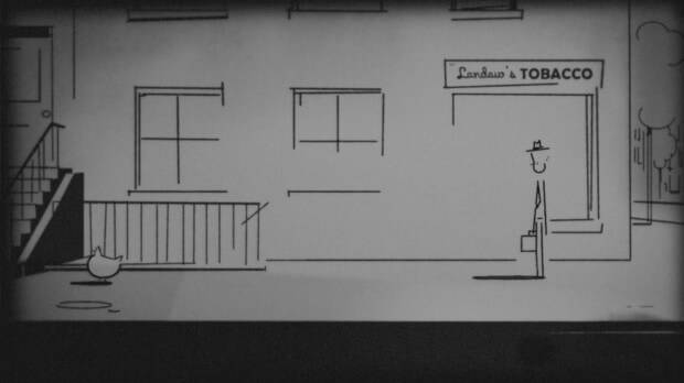
Still from ‘A Morning Stroll’ (courtesy of Studio AKA) 1959. The design of the first part of the film clearly shows the influence of Emile Cohl and the subtle use of vignetting also helps allude to early cinema.
When it comes to bold and imaginative design ‘A Morning Stroll’ is a useful film to study. To begin with I wanted to know what it was about the original text that had appealed to Grant in the first place.
Initially I wanted to make a quick one minute film. I’d loved a one paragraph story published in Paul Auster’s ‘True Tales of American Life’ about a woman who spots a chicken walking down a busy city street. It felt like an urban myth, and urban myths always get exaggerated and pulled in different directions with each re-telling. They’re compelling and funny and you’re never too sure whether to believe them or not. It got me thinking of how ordinary those elements are, but how subtly, slyly surreal they are together.
At the same time I was reading ‘Exercises in Style’ by Raymond Queneau. It’s a book that retells the fairly ordinary story of a man on a bus 99 times in 99 different styles. I think those two influences converged and gave the basis for ‘A Morning Strolls’ triptych structure.
This triptych structure with three distinct genres has a multitude of influences. The film opens in a black and white late 1950’s New York. Simple shape vignettes, an aesthetic of design that Grant uses in much of his other work (take a look at his ‘Love Sport’ series where he has reduced everything to simple geometric forms) are a feature of the opening shot. Staying true to the triptych theme these repeat for parts two (2009) and three (2059). This use of a triptych motif is core to the whole film, and so I was curious to know if there were any other reasons why Grant had chosen this particular direction for the film.

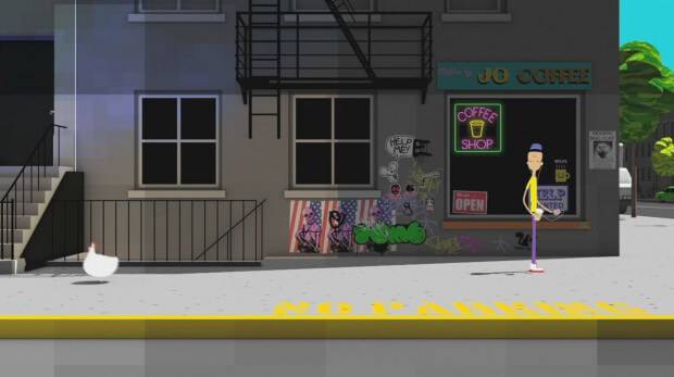
Still from ‘A Morning Stroll’ (courtesy of Studio AKA) 2009. Gone is the simple black and white aesthetic replaced with saturated colours. The feel is much more of a contemporary digital 2D world. The block texturing harks back to ‘Love Sport’
Originally I was going to animate three different versions of the story alongside each other. All would have the same shot compositions and length, but would vary in quite subtle ways. Then I had the idea of setting each section 50 years on from each other, and that’s when the chronological three act structure took shape.
Early animation pioneer Emile Cohl inspired the first section. I wanted it to be really simple but charming. In fact the whole idea was to make the visuals more sophisticated as the story went on, while the narrative and suggested intellectual weight of the piece became less sophisticated. Once we applied the rule that each chapter was exactly 50 years ahead of each other the story seemed to write itself.
It became about the chicken and it’s routine being the one constant in an ever-changing city. The chicken was the ultimate survivor – so in 2059 we just had to find the most challenging environment for it to be placed in.
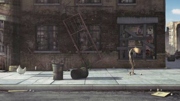
The design of part one (1959) clearly has shades of Emil Cohl’s influence, with it’s simple stripped out aesthetic. It introduces the audience to an evidently earlier time in New York and serves as an effective way of creating a counterpoint to parts two and three. Part Two (2009) by contrast is bold in its use of colour. The palette bears a closer relationship to Grant’s saturated ‘Love Sport’ series which in turn seem to have been influenced by the work of animator Stuart Hilton. The designs and colours that resurface in his folio of work are similarly bold, stripped down and stylized. By the time we get to part three the design has taken another twist as it arrives in a post-apocalyptic zombie holocaust. Here the influences of the graphic comic genre are most evident. The works of Bill Watterson and Bill Sienkiewicz are often cited as of huge importance with Grant’s approach to the look of the film. I was curious to know if there were any other influential artists that had inspired Grant.

Still from ‘A Morning Stroll’ (courtesy of Studio AKA) 2059. The work of Bill Sienkiewicz is more evident in the Zombified future. All three images from the film show really clearly how a different takes and different influences can have such radically different outcomes
Yes I always have been interested in comic art. I love the obviously great Chris Ware, Sammy Harkham and Jason and I really love Christophe Blain too.
Interestingly not only does the film have three sections that look aesthetically different but the means of production are different too. This use of a triptych motif is core to the whole film. Part one stays true to its roots with a hand-drawn look to it. Part two has more of an After Effects or Flash approach to its look. Finally part three is unashamedly high-end 3D CG.
All this makes for a really well considered design that works logically on so many levels. So take a leaf out of Grant’s book and open your eyes and start to distil what you see (and like) into something new and uniquely your own. So finally I wanted to know if Grant had any words of wisdom for aspiring animators with reference to research or just where to look for ideas.
I’d say nothing contemporary. Trust in all the influences you had in the early parts of your life, and don’t look at any images, just read as much as you can. It’s all about ideas; the visuals will come through that.
I would thoroughly recommend taking the time to watch ‘A Moring Stroll’ (if you haven’t already!) and then head off to look at the works of Cohl, Ware, Blain or Bill Watterson and see for yourself how these influences have been synthesised into the one work. In my final tutorial I will be taking you through the production process and looking at the kind of things you need to consider when planning an animation.
http://youtu.be/0-Bl-QWZ2WU
I would like to thank both Grant Orchard and Sue Goffe at Studio AKA for helping me with this tutorial, answering questions, emails and providing the images. Thank you!
Items mentioned in this article:


