Interview with Chris Sickels of Red Nose Studio
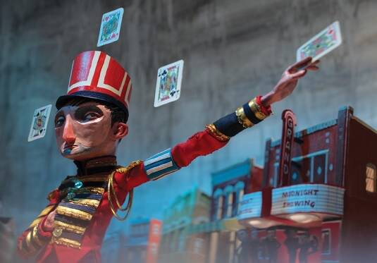
Chris Sickels is an illustrator who creates wonderful worlds and enchanting hand-made characters with found objects collected on his travels. Working under the alias of Red Nose Studio, Chris is known primarily as an illustrator creating work for publications such as The New York Times and the Wall street Journal to name a couple. His work has also been developed into CD covers, children’s books, billboards, theatre visuals and much more.
 I first discovered the hand-carved faces of Red Nose Studio about five years ago and have been following his work ever since. Over the years Chris’s interest and appreciate for the medium have led him to projects and collaborations developing his work into short, stop-motion pieces. Although Chris would not consider himself a stop-motion animator first and foremost, his work has a natural pull towards the medium and he recently completed work on his first short film Creosote, now in the process of being submitted to festivals. We took a little time with Chris to talk about his work, his influences and the future of his one-man studio.
The use of models in illustration is rare, how would you explain the work you create?
It’s always hard to explain the visual aspect of my work. When I’m challenged to explain what I do, I normally just say I’m an illustrator, a visual problem solver and I always leave the technique aspect of it to the side. It’s obviously an integral part of my work but I always try to work with the art director or written piece. But to explain what I do it’s kind of hard, when I say illustrator people don’t always understand.
Garfield was created where I grew up, so if you talked about anything with art you were either a Fine Artist working in a dirty warehouse or you worked for Jim Davis, there wasn’t a lot of in-between.
Could you tell us about how you collect the found objects you use in your work and what you feel this brings to it?
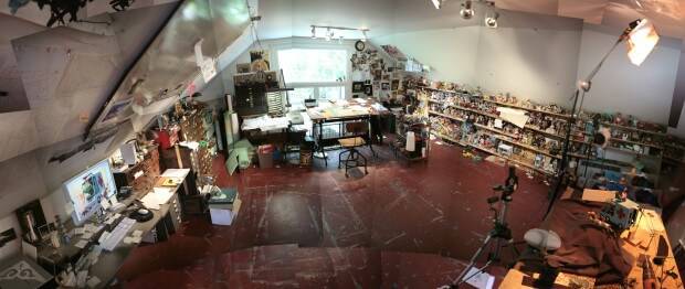
I’ve collected them slowly and from everywhere – off the sidewalk to antique or thrift shops and even auctions where they’ll do an estate sale. I’ll normally buy the junk box, it’s like the junk drawer that everyone has in their kitchen, because inside that you’ll find all these interesting things that have no use but are kept anyway, like broken little light bulbs that don’t work but still have life to them. Snooping around, I’ll pick up anything from little boxes or lenses; it all just sort of accumulates.
To create a textured world within a sculpted world, I try to let the found objects play as much of a vital role as the sculpted objects. There are other 3D sculpted illustrators that make everything, and work towards a specific visual style but I’ve always been drawn to the more textured or eclectic look. Like the Quay brothers did within their early animation using fabrics and texture, live things and dead things, dirty things and clean things.
Your work is incredible, when did things click into place for you in the way you create your images and characters?
I think it was after school. I had experimented with some rough marionette puppets as part of an independent study, there was a local puppeteer in Cincinnati who was doing some really avant-garde puppetry with sounds and smells and recorded audio dialogue, just these amazing sets that were created before your eyes. You would go to one of these shows and it was very immersive, then I would go back to the studio and paint on one of my assignments and it would seem very still and lifeless. So I was really fascinated about how to incorporate dimensionality into my work – whether it was with lighting, sound, structure or textures – and I didn’t really no how to do it. So I tried puppets and I was terrible at it; I’m not a performer, the stories weren’t very good, but the sets were very cool.
So then I started dabbling with a bit of stop-motion, because you didn’t have to be a performer in front of a live audience. So eventually I wanted to fold in what I loved about the fabrication and dimensionality of the characters, with what I love about illustration as a problem-solving medium. There was period between 1998 to 2004 where I was doing both a bit of 3D and paintings, then eventually the 3D work started to take off. It took a while to get into it and convince clients that had previously hired me for painting to try the 3D work, as I didn’t know how to photograph it or how to do it on tight timeline, so there was a lot that I had to figure out over the years to make it work. So then it evolved into what it is, if I sat down and did a painting I don’t think it would be much different to one of my photographs, it’s just an extension of how I draw.
 Your work normally sees the light of day as part of magazine editorials, but you have also created work for album covers, billboards, books and even theatre. Are there any other areas you’d like to extend your work into?
I don’t know. I guess I should’ve had more of a life plan, huh? Advertising work is always fun but maybe not as creative as editorial. Also theatre work is great but awkward as it has to work with people, as a lot of my designs as they are now don’t have to function, they just need to look good in the photograph. When I did this work for a local ballet I helped design, when it came to the costumes a lot to them were immovable, or they looked really good but when they swung around they were going to have someone’s eye out! So there was a neat aspect of problem-solving there, it also had to be economic and efficient, so nothing too complicated, it took a lot of rethinking. I was definitely interested in that and it was neat to see it take a life of it’s own beyond a photo.
You’ve recently published your third book, called The Beginner’s Guide to Running Away From Home could you tell us a little bit about the process behind the book’s creation?
That particular book was written by author Jennifer LaRue Huget, she has published some books with the same publisher Schwartz & Wade Books before. They approached me with this book and I was intrigued with the story. It’s about a boy who’s telling the readers how to run away form home. I wasn’t sure how well it would go over with parents – or librarians, for that matter – but they approached me with a manuscript and I got to play with it and they really do just let you create the world, the characters and visually interpret what the writer has written. It’s an interesting working process where the writer has done their part and the editors wants the artist to do their part, so they keep us very separate and they get a unique product that way.
It normally takes around twelve months for me to do a book; from sketching it to finishing it. That can be a huge chunk of time, so I normally pick a story that I would do for free anyway because it’s going to take such a long time to do.
I know you worked with the Chiodo Bros on your short film Innards and more recently a piece for Greenlaw. With your work being naturally well-suited to stop motion films what are the main challenges within that?
The biggest challenge for me, which is also what I find most interesting, is the storytelling aspect because so much of what I do is geared towards telling a story with a single image, where in animation your options are endless. So for every shot I have to think so much, like I do with a single image illustration I have to think in terms of composition, of the best camera angle, I get very overwhelmed by that. Even with the PSA, there were probably only ten shots in the whole thirty seconds but it was still hard to figure out what composition would be best for this particular aspect, what angle would work better and, if the boy’s peddling his bike without a rig to make my camera follow, how do we make him feel like he’s being followed? I feel very limited in vocabulary when it comes to that as I try to keep shots simple and compositionally-based more so than action-based. I see so many films that do great shots with a simple camera move or even how the character flows though the composition and when I look at my work I feel like it’s very static. It has a still-frame feel to it which I think comes from my training as an illustrator. I always get a little hung up with that.
I remember in Innards we only had twelve heads, it was terrible but I remember locking myself in a room for about a day and a half to paint those faces, it was very much like an assembly line but it was just me. Especially the eyes – because we didn’t have the eyes move so we had to do pencil tests with them to make sure everything was lined up. What I learned from that day and a half plays such a big role in what I do now when I paint faces. We also had access to an armature for that film, it wasn’t perfect but it was ball jointed. I feel if you get a good armature it almost animates itself a bit, whereas with a wire armature they have a life of their own and you really have to embrace it.
So with the work I do now, which is all wire armature-based, I try to embrace those quirks and let it become what it is. Personally, because my skills are very limited, I try to allow it to work as it is, especially with the recent PSA that we did. It’s pretty glitchy, I think even my hand was in it a little bit so we had to fix that!
I do these very low-tech animation workshops, it’s a self-contained animated set, I bring the puppets and people get to play around with them. We normally focus on short little loops, which allows them to embrace the action of stop-motion without thinking it, because you can really overthink it. I’ve seen a lot of people start and shut down because they get to a point where they can’t deal with all the detail. So with those workshops I try to show people that you can animate anything and get a kick out of it. When I see them take what they’ve learned at those workshops and do something more, that’s when its interesting to me.
I’ve seen your working on a new short film called Creosote, can you tell me a little about it?
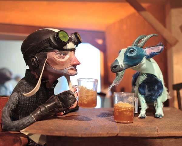
It’s all shot, it’s about two and a half minutes, I’m at the point now where I’m a little out of my realm, so I’m trying to think about the best way to edit it and incorporate sound. There have been several musicians I’ve approached, so I’m trying to figure out who’s the best fit for it. I’ve been approached by enough animated projects that I think if I just put something out there people will make a better connection with it. So Creosote is just a simple story about a stalled traveler who comes across a centaur with a drinking problem who offers to repair his car for a favour in return. It’s not a soul-searching story with a great ending, but it has some interesting characters and potential.
You can check out more of the work of Chris Sickels on his website and can also follow him on Twitter. Creosote is being entered into festivals as we speak with a plan to release it online at the end of the year. In the meantime, however, Chris has created downloadable paper versions of the characters from the film for you to animate with. Neat stuff!


