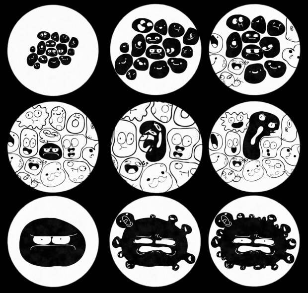
Blue Zoo Present, The First Murder
Blue Zoo, the innovative animation studio behind such TV hits as Q Pootle 5 and Tree Fu Tom have taken a trip back in time, billions of years in fact to the first few seconds of life itself for a new short film. The First Murder is directed by Philip Brooks and Alec Smith, who are currently developing series for the studio, and features a myriad of voices by Adam Buxton who plays every character in the short including the murderous Colin.
We bent the ears of the directors to find out how creating a film like this fits into the daily schedule of a busy working studio and how it was all put together.
How did the project originate? Are side projects common at Blue Zoo or was it part of a commission?
Blue-Zoo has a short film initiative where every few months everyone gets to pitch an idea and after a voting process, one gets made. It’s a good way to try out some new styles and techniques but also a way to give people in the studio a chance to direct. In our case it was an open brief and The First Murder was an idea we had knocking around but never did anything with.
Where did the idea for murder come from? Murder is usually such a grim subject but this film is quite cheery!
Murder is lovely! You should try it. No subject matter is out of bounds in comedy and we liked that contradiction of something so awful happening, but no one understanding that it was awful. The other cells just want to embrace life and any new experience, is one to get excited about. Unfortunately for them it involved being murdered through the face.
The main influence for the story is really based on that guy on your train, the one squashed between a man talking really loudly on his phone, the kid with his music blaring and the woman’s handbag that occasionally knocks against his face. Watching him slowly boil with rage and secretly hoping he snaps.
How did you develop the look? What software did you use?
The aim was to make something that if paused at any point, would appear like a bunch of ordinary cells under a microscope. So the eyes and mouths were made to feel like parts of the cell, as well as one another. Sometimes they even swap places and an eye animates as the mouth.
Almost all of the look came from After Effects, using video and high resolution photographs of different cells for reference. We then used aspects of the different elements and emulated them in our render and comp files. We found very early on that we needed lots of specific passes rendered from Maya to emulate an aspect of our reference, using the outputted renders in a combination of ways in After Effects to get the look finalized.
What made Adam Buxton the perfect choice to cast as, well everyone?
Anyone who’s listened to his podcasts will know that he can do a thousand different voices, which is essential when you have a thousand different characters on screen. The best way to describe his voice is “meaty”; it’s just thick and tasty.
Being a comedian meant he would nail the timing and make our lines better than they actually are. Adam also improvised on lines and the outcomes were always brilliant, he even snuck in a tiny bit of Boggins which was a treat.
Did you use or develop any new or notable techniques?
Some of the key technical difficulties was the level of detail in the noise required and the fact the cells did not have UVs created problems for rendering without flicker. We used a combination of several layers and passes to create the effect of the cells, using an array of effects in After Effects to create the different looks.
The animation was hand keyed with simulation and dynamics applied on top, so meshes deformed against one another which really helped make it feel organic. This also led to a lot of trial and error.
Are there any techniques used in this film that you’d like to explore further in other shorts or other work?
I don’t think so, every project is different and any techniques used were specific to what we needed. It was great to use a non 16:9 aspect ratio for once, so exploring composition through changing aspect ratios is something I’d like to explore further.


