The Art of Mr Peabody and Sherman – Review
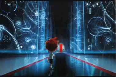
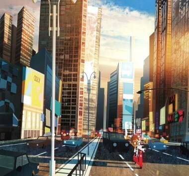
Animated CG films seem to have taken on a very generic style and Mr Peabody and Sherman was sadly no different. In spite of this there were suggestions in the film of a more unique style trying to come through. The high-rise cars, the enlarged heads and angular architecture all screamed out 50s Cartoon Modern, a suspicion confirmed by ‘The Art of Mr Peabody & Sherman’, a book cram-packed with Cartoon Modern related content and designs, providing a wealth of material to add to the movie.
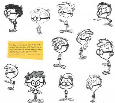
The introduction to the book by Ty Burrell (Mr Peabody) sets us on a reminiscent journey back into his childhood. His fond memories of Jay Ward’s inventive creation of Peabody & Sherman matches director Rob Minkoffs’ passion, the same passion which pushed them to work closely with Ward’s studio to create something that carefully mirrored the original, including the iconic design of its era. The opening section shows how the artists transitioned the characters from a flat, 2D world into what we see in the 3D film. The illustrations are plentiful and there is real opportunity to compare both styles from the old to the new. The character of Penny is a really intriguing one, as she was a vital new character to the story and needed to blend in with the already established Peabody and Sherman. The explanations and artist comments help to give an insight into the array of decisions that were made in her creation. The illustrations, though plentiful, look very much the same and it’s hard to tell how the character actually developed on a visual level.
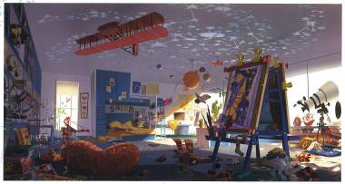
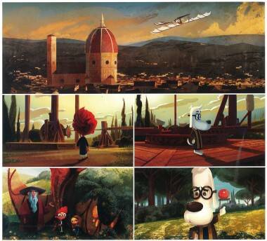
‘Peabody’s World’ is the section that quickly becomes the highlight of the book, covering Peabody’s pad, Sherman’s room and all the worlds they travel in. If you’ve seen the film then your intrigue must have been drawn to Sherman’s bedroom, stacked full of ‘figures, posters and books strewn about’ making it a room that any child would love to have. The art of this setting looks to be an artistic treasure trove of knick-knacks and fun props. Hours can be spent poring over these these cracking backdrop designs, finding different details here and there. It really makes you want to watch it all again to see what you’ve missed. All the locations that P&S visit are covered beautifully within the ‘Art of’ pages, from characters to props, locations to story sketches. As well as existing locations we are treated to a selection of rare, proposed locations that didn’t make it – is this the directors way of telling us that a sequel could be in the pipeline?
As well as a wealth of illustrations covering all the usual bases, the unique part is left until the end; A step-by-step guide through the making of a scene within the film, told by the characters themselves. For a non-animator this is a great insight but upon further reading a seasoned pro might find this section unsubstantiated and vague.
Altogether the imagery and illustrations within this book are a great look at the process of creating the film. The images really take the film further and with glimpses into unseen story and character developments, it really delves you into the very heart of the development. For someone in the industry this book provides very few things that haven’t been said before, while on the other hand poring over the pages does prove incredibly inspiring and it’s hard to not keep racing ahead to peek at further designs. A great accompaniment to the film and something Peabody would be proud to put his name to.


