Interview – Animade on new short ‘Chronemics’
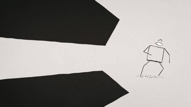
Earlier last month the dynamic group at London-based studio Animade presented their short film Chronemics. The combination of simple, stripped back design and the award-winning animation we’ve come to expect from the studio brings together this unique story of dark vs light.
Originally created as idents for the German/French TV channel Arte, the team combined the scenes together to form an elemental narrative that harkens back to the strength of physical comedy and early Eastern-European animation. After recently moving to bigger premises this modern studio is fast becoming a go-to place for fresh and extremely accomplished animation and interactive media. We caught up with the team to discuss the film in more detail.
The film originally started as a series of idents commissioned by the German/French channel Arte. Can you tell us a little about their brief and what parameters they had for the commission?
The brief was very open. We had the deliverables (one minute intro/outro and twelve 15” vignettes) and the theme ‘the shortest day’. It was perfect really. We had the freedom to create our very own concept and narrative with just a pinch of requirements akin to a more client-based project, giving us a structure and deadline to aim for.
You then took these 14 idents and strung them together into the film we see now, was that always the idea or did you decide to do that after the fact?
From the start of the project we were keen to retain ownership of the work in case we had the option to push the project out through other avenues. However it was part-way through production, after we’d all got so invested in the characters and their universe, that we realised a full edit was something we all wanted to see. We didn’t know if it’d work but we were going to give it a bloomin’ good try!
Chronemics is your first full team effort piece, how did you go about the development and creation of the film?
We had a good few internal meetings batting around design ideas and concepts for the project. The results of these meetings were distilled down by Ed, our creative director, into the final design and narrative arch. We then divided the 14 vignettes between the team. Each member could treat those sections as their own, taking them from storyboard to final animation.
 The film has a very Czech/Eastern European feel to it, both in look and style. Who (and/or what) did you look to for inspiration?
Their wasn’t any one piece of inspiration. We looked to Looney Tunes for the sketch-based narrative structure, while the characters’ aesthetics are loosely based on hieroglyphs or cave drawings, befitting their raw godlike characteristics. We knew we wanted something a little darker visually as a break-away from our usual stuff but we had to keep it simple to enable a greater amount of character animation within our schedule. This treatment also seemed to fit the ‘shortest day’ theme pretty well.
As always with the work that comes out of your studio, there has been superb attention to movement and timing. Was there ever a point where the relationship between dark and light ever proved a challenge to visualise?
There were very few visual challenges; in fact dealing with a very stripped-back design means a lot is possible both technically and narratively. The simple character forms allow more time for animation and playfulness with forced/exaggerated poses. The play on light and dark and the spacial divide between the two inspired playful situations, most notably Milo’s woodcutter scene.
The biggest challenge was probably the grading of the film. The light and dark elements on-screen are graded individually to achieve a certain look so we couldn’t use a straight overlay. The grade was applied within each scenes’ master file so any little tweak to the colour, for example, had to be applied to 14 different projects! (…and thanks for saying our movement is ‘superb’! Too kind!)
You’ve released the short online, how has the response been to the film and what’s the plan for it now?
The response has been fantastic. We were really worried it wouldn’t feel like a unified film given its beginnings – maybe we’d looked at it too much – but everyone’s being saying lovely things. We’ve sent it off to various festivals as well in the hope that its online release won’t prove an issue. The studio hasn’t hit the festival scene yet and we’d love to immerse ourselves into that side of the community a little bit. Whatever happens, we just want to share the film as much as we can.
You can check out more of team’s work on their website and Vimeo channel, as well as following them on Twitter.

