25 Years of the McLaren Award 2004-2008
Another selection of McLaren award winners means another display of variety and entertainment. There is something for everyone here from a punk response to big brand consumerism to the Mission Impossible with Grannies, the beautifully presented story of a terrifying human monster to space explained by a child in sand, and of course the late, great Run Wrake flexes his creative muscles in amongst the winners here too.
In 2004 we saw two winners walk away with a McLaren award, we reviewed the Shynola and David Shrigley music video Good Song in the previous article and we will start with John-Paul Harnley’s NFTS film Brand Spanking here.
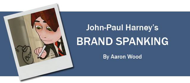 I saw this film at my very first animation festival, the Bradford Animation Festival 2004. It came at a period when I remember there being a lot of talk about 2D versus 3D; “Is 3D going to be the future of animation?”, “Is 2D going to die out?”, and other such similar thoughts and worries. So when I saw Brand Spanking, I remember finding it interesting how it had merged CG backgrounds with 3D-come-2D characters and I wondered “Is this a style we could be seeing more of in the future?”
Brand Spanking tells the story of how a “struggling comprehensive school gets a make-over courtesy of the private sector”, with everything being sponsored by the likes of Cola Cola and Beagle Tobacco. We witness a frightening future where schoolchildren are mindlessly influenced to consume, at the expense of education. The story itself has always reminded me of Halas and Batchelor’s Automania, in the prophetic way; it imagines what the future could be if mass consumerism and the world’s corporate giants get their way.
The voice cast is quite a mixed bag – at one end of the scale we have British comedy legend Prunella Scales (Sybil of Fawlty Towers), and TV presenter Mariella Frostrup, while at the other end we have the lesser known voices of journalist/author Mark Lawson, and BBC’s Andrew Marr (his only other acting credit being Doctor Who, where he played himself!).
After watching this film again 10 years later, my original impression of it has worn off. The style and animation appears very dated and I don’t identify with the cynical idea of consumerism that I perhaps did all those years ago at my first festival. But if you haven’t seen it, you really should if only for the “plethora of fleeting visual gags” and the early use of 2D & CG environments.
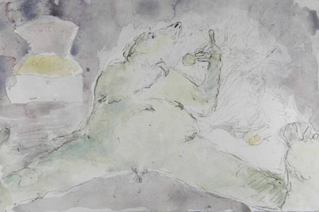
 Elizabeth Hobbs is a freelance animator based in London, her background in printmaking and artist book come through in her technically challenging and absorbing animated films. Hobbs often uses little known or unused techniques to create whimsical and gripping films. Her films have included hand carved rubber stamps printed directly onto 35mm film for her most recent film Imperial Provisor Frombald.
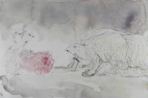
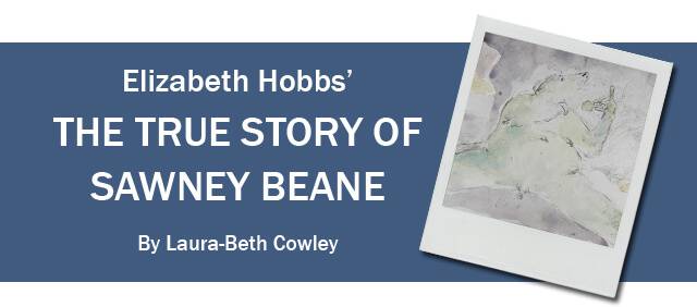
However it his her short film The True Story of Sawney Beane created in association with National Film Board of Canada in co-production with Red Kite Animations Limited in Edinbugh where Hobbs was living at the time, tells the story of the Scottish fable Sawney Bean the legendary cannibal, this delicate animated short tells this harrowing tale from the perspective of the mother (perhaps inspired by Hobbs own pregnancy at the time of production), and shows how much her love for her son can endure.
Each shot was created on a single sheet of Somerset Satin paper, cut down to A6 format. The image itself was drawn using charcoal and watercolour; she captured each frame on a Digital SLR on video mode, she then erased and redrew the next frame. The individual fames were then assembled in After Effects. This labour intensive method contributed in no small way towards to overall appeal of this truly enthralling piece of experimental filmmaking.
Winner of the McLaren award in 2005, this short film captivated the audience and jury with its use of traditional techniques and unique narrative. The short film also went onto be nominated for a Scottish BAFTA in 2005
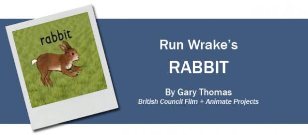 Rabbit is one of only three independent films that Run Wrake made, along with Jukebox (1994) and Down with the Dawn (2012), in over 20 years. He worked constantly, however, across different forms – music video, advertising, graphic design and tour visuals for bands including U2 and The Rolling Stones, and he is one of a small number of British animators to have sustained a career where a personal, distinctive and unmistakable style carries their work and the range of commercial and personal projects.
http://youtu.be/fw3XyOyl47Q
Having chosen to study graphic design because he believed it was inherently democratic, his acknowledged influences – early hand-drawn animation, Dada, Pop Art, and punk graphics – are readily apparent in his work, reflecting this open approach, which was further distinguished by an engagement and creative collaboration with producers, music and musicians. But his style is his own particularly in its use and mastery of the animated loop as a visual parallel and complement to musical rhythm and structure. His long-term collaborator Howie B composed the soundtrack for Rabbit, but unusually for Run, the film did not begin as a response to music. This dark morality tale – greed corrupts two very naughty children who get their comeuppance – was inspired populated by characters and imagery from 1950s educational stickers that Run had discovered in a junkshop many years before, and to which he returned in a concerted and successful attempt to develop a stronger narrative drive in his work.
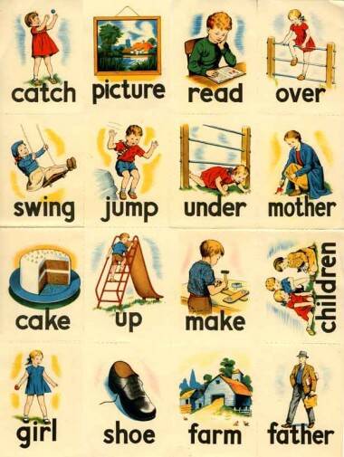
For more behind the scenes images click on the picture above to view them on the Animate Projects website
Rabbit is often described as simply a ‘found’ material film, but this material is transformed and critiqued, its innocence subverted and combined with dynamic hand drawn and graphic elements to transform the material and embellish the storytelling. It is a masterpiece and along with its McLaren Award, the film garnered two British Animation Awards, a BAFTA nomination, and prizes at 17 festivals including Rotterdam, Holland, Hiroshima and Annecy.
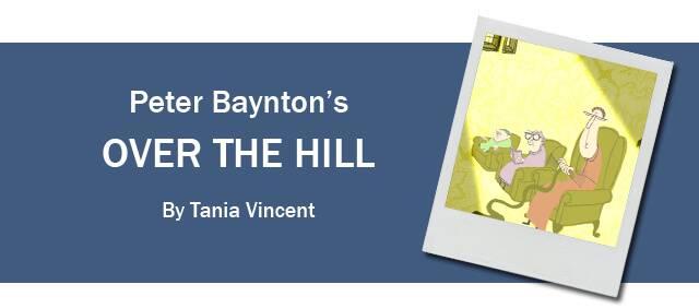 In 2007 Radish Pictures released the short Over the Hill This 8 minute short won the McLaren award for its simplistic story lines, interesting design choices and great score.
This dialogue free animation is centred on a group of old ladies in a nursing home. The piece starts by highlighting the day to day monotony of a home for the elderly. The residents go about their business but it soon becomes apparent that not everything is as it seems. This realisation is built brilliantly with the old ladies finishing their tasks slowly and gracefully only to be manhandled by unseen care assistants. Soon we see that all the ladies are being watched by a sadistic, pointy faced nurse. The first time this character is presented to the audience is in dark lighting which is a stark contrast to the precious bright and colourful scenes. It is revealed that this nurse scans the residents brains and if she doesn’t like what she sees she disposes of them. Unfortunately she accidentally takes the wrong lady. This leads to our heroes discovering a well hidden secret. From here on in hilarity ensues.
The unlikely heroes of this piece are the nimble 3 old ladies who’s distinctive silhouettes and simple differing colour palettes makes them both distinguishable and interesting, visually. Their movements are precise and not how you would expect an old person to be animated making them instant underdogs since they don’t seem to belong in their surroundings . The nurses, who are only ever seen in red, symbolize the danger these old women have to face.
It’s a funny, quirky and light hearted piece of animation that combines vectors and flash to give this animation a lovely illustrated feel. The score of this animation is very complimentary and serves to give the emotions of the scenes without any characters ever uttering a word. Peter Baynton does a great job by keeping this animation entertaining yet simple through his influence in all major parts of production such as the writing, animating and directing.
Peter Baynton’s most recent work includes the Vimeo staff pick The Lion which concentrates on an equally simplistic style that you could say is reminiscent of a Wes Anderson style with its tonal palettes, continues shots and use of symmetry and shapes. Hopefully there will be much more work like this coming to our screens soon.
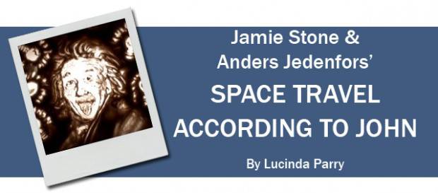 Space Travel According To John starts off as a seemingly simplistic look into an innocent child’s view of space and the universe. It opens with childish conversation and yammering put forth by John (along with another child, Magnus) as we follow him talking about space travel. It is spoken with excitement, apprehension and vivid descriptions by Johns and he delineates his thoughts and feelings. All this is contrasted by the rich tonal sand style animation that accompanies the sound (I say sand style but the material used is actually washing powder). The contrast is interesting as John’s descriptive language is colourful and loud, whereas the sand is limited and dark. The mood shifts towards the end of the film and becomes connection with Johns dark existential thought on how we could be all alone in the universe and how that in itself is scary. The nothingness of no life in the universe is reflected in the absence of substance on the screen, you are left with just the glowing light at the end. It is a somewhat sad and humbling note to be left on when a minute earlier there was talk of aliens and jelly monsters and an imagination bursting with things that could exist.
It is an interesting, thought provoking film showing how space is seen and thought of today. It is the great unexplored expanse that we know so little about which allows for enthusiastic speculation. At present space aliens and long space travel are just fiction but it is a concept that plays with many people. The possibilities and the potential for space are as numerous as the tiny grains occupying the screen.
25 Years Of The Mclaren Award Articles


