Cartoon Nation: A Chat With The Talents Behind ‘Tales Of The Spiffing’
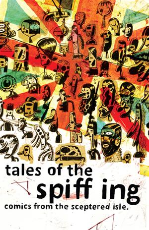 It would be fatuous to claim that Bristol’s reputation as one of the most important animation towns within the UK isn’t owed to the presence of the cultural powerhouse that is Aardman Animations. Serving as something of a magnet for bright-eyed, recently-graduated hopefuls and wearied, seasoned industry veterans alike, the studio’s output has the unique duality of being both reputable for their high bar of quality as well one of the UK’s most beloved cultural institutions. The appeal of their animated films, commercial work and television series has long since spread to an international level while fundamentally retaining its British roots.
It is fitting enough, then, that when a collective of Aardman staff put together their own self-started graphic novel anthology, the stories would be loosely bound by the theme of ‘The Sceptered Isle’. So was born ‘Tales of the Spiffing’, the brainchild of Aardman story artists Ashley Boddy and Jean-Philippe Vine. Alternately comical, sombre, deadpan and poignant, while remaining consistently absorbing on a visual level, the book’s twenty-two contributors hold/have held a variety of roles within the company, spanning directors, animators, story artists, designers, VFX specialists and concept artists. The stories and artwork themselves are an endearingly eclectic mix of gender ambiguity, WW1 combat, truculent nuns, workplace nudity, bloodthirsty vigilantism and astronomical endeavour to name a few. It makes for a very worthwhile read to any fan of the mediums of sequential storytelling, animation, fine art and illustration alike.
I caught up with some of the book’s collaborators to learn about its backstory and how they took on the challenges of applying their skills to the world of comic book storytelling.
THE ARTISTS
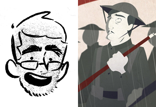
Ashley Boddy (http://www.inner-workings-of.blogspot.com/)
Story: ‘Tommy’
Role: Currently I’m working in Aardman’s Feature Story department as a story artist on the 2012 release, ‘The Pirates!’ Along with JP Vine, I’m one of the editors of the book.
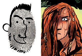
Jean-Philippe Vine (http://jpvine.com/):
Story: ‘Boudica’
Role: Well, I no longer work for Aardman (don’t tell anyone)- I was a director on ‘Shaun the Sheep’ and a story artist on the new ‘Pirates!’ film. I’m currently swimming about in the world of freelance.
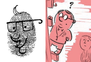
Jay Clarke (http://jay-clarke.blogspot.com/):
Story: ‘The Waterstein Babies, Vol. 1’
Role: I am – and have been for the past eight years – a story artist with Aardman, working with well-known characters such as ‘Shaun the Sheep’ and ‘Wallace and Gromit’.
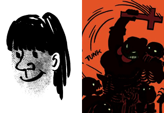
Emilie Timmermans (http://www.ems-timmermans.blogspot.com/):
Story: ‘Sister Angelica’
Role: I went to Aardman to do animation training in Maya and got to draw five storyboard panels on ‘Pirates!’ I hope to join the merry lot again sometime in the future.
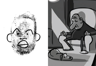
Matt Jones (http://mattjonezanimation.blogspot.com/):
Story: ‘Red Wharf Bay’
Role: I was a Story Artist on Aardman/Sony’s ‘Arthur Christmas’ in 2009.
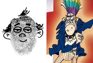
Rej Bourdages
Story: ‘The Amazing Adventures of Trevor Vicious’
Role: I was head of story on ‘Pirates!’ but am presently a story artist at Pixar.
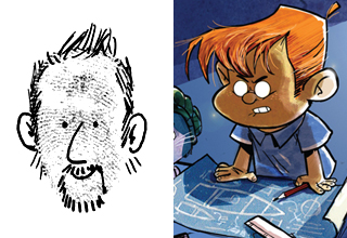
Andy Janes
Story: ‘Schoolboy Space Race’
Role: I work mainly on storyboards, concept artwork and design, along with bouts of script development.
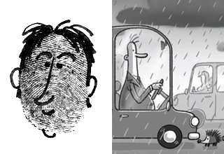
Michael Salter
Story: ‘Hedgehog Day’
Role: I’m Senior Story Artist at Aardman.
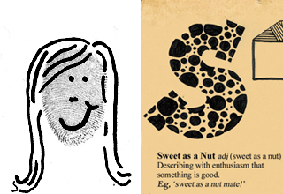
Sarah Matthews (http://sarah-matthews.tumblr.com/)
Illustration: ‘British Alphabet’
Role: I’m Junior Designer in the digital department, my role is to help in the design process of our digital content, from websites to games, and all the fun little bits in-between.
Interview:
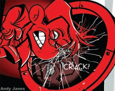
Artwork by Andy Janes
It’s almost surprising that this project is the first of its type to be generated from within Aardman, especially given what would have to be a wealth of exceptional artistic talent within their studios’ walls. Where did the idea originate?
JP: Ash and I initiated the project mostly out of pure jealousy of other studios’ independent books: notably ‘Out of Picture’ by the Blue Sky artists, and ‘Who is Rocket Johnson?’ by the Disney artists.
Jay: The idea of a comic anthology had been around in many different guises for quite a while, as it was something that we all had the ambition to do. Then, more and more as the American animation studios produced their comics, we felt it was time to throw our British hat in the ring.
Ashley: In terms of the idea to have an Aardman Artists’ book, that has been floating around for years.
JP: On a personal level, I felt that Aardman has a worldwide reputation but the artists within needed to get out there and showcase some of their skills. The Americans can’t have all the fun!
Jay: Ashley and JP took the initiative and put out the rallying call for any artists that would like to help make it happen. I joined the team as Assistant Editor with a more limited editorial workload as I’d just had my first baby around that time!
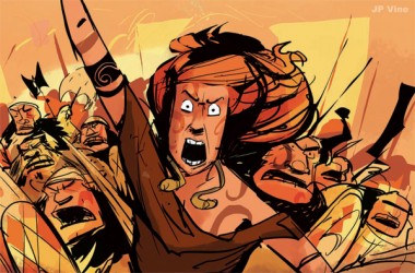
Artwork by Jean-Philippe Vine
For the artists involved, how did you come to hear about ‘Tales of the Spiffing’ and why was it of interest to you?
Emilie: It was introduced to me by Ashley. We were walking to the movie theatre when he said, “Want to make a comic with a bunch of Aardman people?” I said, “Sure!”
Rej: Ash told me the premise of the book he was making and it sounded awesome! I definitely wanted to be a part of it.
Matt: Ash and JP are both strong storytellers and I wanted to support them in their first publishing venture. Contributing eight pages to an anthology book was a good way to see my own work published without having to produce a whole graphic novel!
Andy: For someone who draws all day long and loves comics it may seem odd that I had NEVER managed to produce a finished page of comic art. So when the notion of producing a comic was touted about I jumped in. I was a tad worried about finding the time to produce the artwork and write the story, so had a go at producing a ‘Minnie the Minx’ page (which has the honour of being my first comic page ever!) which seemed to go okay, and from that moment I was committed. Then came the daunting task of finding a story.
Michael: I work in the same department as Ash and JP. It was a good project to work on in my downtime. A chance to draw some of one’s own stuff – not ‘Pirates!’
Sarah: I was lucky enough to take part in a small exhibition called ‘The Flip Book Project’ for UWE, which asked some of the Aardman folk to create a flipbook, and through this was asked by some of the ‘Spiffing’ artists if I’d like to do some pin-up pages for the book! I jumped at the chance as I’d always wanted to be in a publication of some kind, and it was a huge honour to be in a book with so many amazing artists.
Ashley Boddy
Considering the scope of the project, what sort of timeframe were you working within?
JP: Ash? It was about six months all in, wasn’t it?
Ashley: I think it was April 2010 when we said “Let’s do it!” and actively started to get people who were interested in contributing, but no one really got going until July-ish.
Matt: I played around with different concepts for a while, then thumbnailed the final idea over the summer 2010, finishing the final art in a mad dash towards the end of the year after moving to California.
Ashley: Around August we started seeing a (really) rough version of the book come together. That was a pretty morale boosting moment actually…finally getting to see all these ideas as visuals instead of just being people saying “I’ve got an idea in my head but haven’t got it down on the page yet”! We went to print in late November, so overall about six months.
Andy: I left finishing the comic till the last few months and ended up working till midnight most nights, as well as working on my main job during the day. The script was being written and changed as I went along, although I had the basic idea planned out. I’m sure if I had ten weeks or a thousand years I’d still end up in a panic at the end. Just seems to be the way I work.
Sarah: As I was invited into the project at quite a late stage it was a fairly quick turnover. I think a month or so, though most of my time was spent on coming up with an idea that would stand out from the comics while still being engaging.
Artwork by Emilie Timmermans
Given the collection is thematically about Britain, what determined your particular choice of subject matter? Were there any British institutions or historical legends that appealed to you in particular?
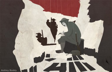
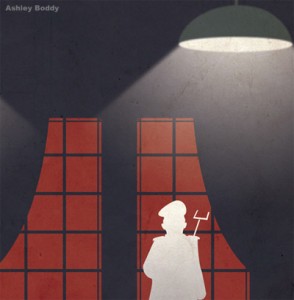
Ashley: For me it was colonialism, the Empire and the British military. Those are pretty much the first things that come to mind when I think ‘British’. So I guess that is probably where the idea for ‘Tommy’ came from. I almost went with another story about the Battle of Balaclava but couldn’t fit it to such a short space.
JP: We chose the British as a banner theme but held it veeery loosely. We want this book to make an appearance in the animation community globally, so thought the theme could help it stand out. For me, I was always interested in something gory and battle-filled, and the Romans in Britain provide almost too much inspiration. The story of Queen Boudica was just too big to squeeze into a short story, but I thought that telling it from the perspective of a Roman soldier would give me a narrower lens to work with.
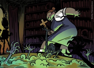
Emilie: I’ve always been fascinated by boarding schools. They’re a little world on their own where any kind of story can happen.
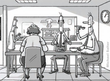
Michael: I must admit I didn’t pay too much attention to the theme. Luckily the mindless repetitive aspect of working life applies well to British as well as most western cultures…just with more rain.
Jay: With ‘The Waterstein Babies’ I was influenced by the history of documenting Great Britain as a once powerful force in the world, a beacon of industry. In this documentary approach it felt like I could approach the journey of a once great Empire, through five Britons; That in some way their life journeys would reflect the ongoing journey of Great Britain. Terrence Malick’s new film ‘Tree of Life’ has a similar, but grander, theme – that all of nature and time can be expressed through a single family. Ultimately, I do see the individual Waterstein babies as a family of sorts.
Artwork by Matt Jones
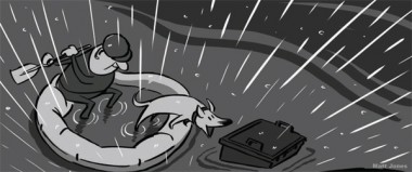
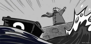
Matt: Being a Welshman, I figured that could be a unique entry into the collection. While searching for ideas an interesting true-life story hit the media over the summer, which attracted my attention. Bert Forking’s ‘wheelie bin rescue mission’ (http://www.bbc.co.uk/news/uk-wales-11268644 ) appealed to me as a small story on a large canvas; a regular Joe literally getting out of his depth and ending up in the national media.
Rej: I’m originally from Canada and am now an American citizen, so I thought I could give a bit of an outsider’s view of England, stupid little annoyances and observations of somebody from abroad. I love living in England, but there a several petty things that I thought I could shine a tiny spotlight on.
Artwork by Michael Salter
Andy: Due to my deciding to start the comic a bit later than planned I didn’t feel I had the luxury (or nerve) to try something new, so I dusted off an old idea of mine about a kid going to the Moon. This was an existing idea for an animation special/feature I’d worked on years ago. The idea as it stood was totally revamped to skew it toward the British theme, as well as adding the wonder that is Patrick Moore into the mix.
Sarah: I loved the theme as I’ve done a lot of personal work based around the British and their cities. I wanted my piece to also tell a story even though it was not a comic strip, so I decided on a very British alphabet as it conjures up images of stereotypical, humorous, British people and strong cockney accents, so I think the audience still get a sense of different characters in their minds, and hopefully it’s still fun and keeps the reader amused. As cockney rhyming slang is so iconic I felt it deserved to be celebrated.
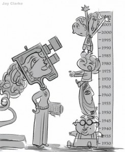
Artwork by Jay Clarke
Where there any particular artistic influences which you drew upon when it came to your illustration style?
Ashley: Google…Image…Search. And I have a large collection of French Bandes Dessinées…which is odd, considering I don’t speak French.
Michael: There is an artist I like who does illustrations in the Guardian called Tom Gauld. My more minimal style has shades of his work.
Jay: I drew on the style of Edward Bauden – a great and playful illustrator who created the labels and packaging designs for London’s Fortnum and Mason.
Rej: Being a story artist, I’m inspired by most of my fellow board artists. I love a looser, cartooney style. I’ve always loved ‘MAD’ magazine’s Sergio Aragonés, and so I think I’m a bit closer to his comic drawing style.
Matt: The comic book work of ‘MAD’ creator Harvey Kurtzman really inspired me. I wanted to keep the artwork simple and evocative, like his ‘Hey Look’ strips or early ‘MAD’ covers. Yann Martel’s ‘Life of Pi’ has long resonated with me for its lost-at-sea passages. Plus, an old man on a grand adventure is always entertaining, such as Pixar’s ‘Up’ or David Lynch’s ‘The Straight Story’.
JP: My style mostly came out of deadline panic, so it was almost automatic. I was looking at Gabriel Ba, and praying to Mike Mignola for help on my colours. I’ve always loved loose expressive inking like Ashley Wood’s or Doug TenNapel’s.
Emilie: I mainly looked at Thierry Martin’s work, especially for his inking. He inspired me to give old fashioned – but never out of style – brushwork a go. I consider him a master of that craft.
Andy: I’ve been a fan of comics since I was a wee nipper, reading the various IPC and DC Thompson publications, though sadly I was born too late to enjoy the TV21’s first run. Also ‘Vulcan’, which was my introduction to the fab artwork of Don Lawrence and ‘The Trigan Empire’. I’ve since managed to pick up quite a few pages of his original artwork, including colour work on ‘Fireball XL5’ which is a joy to see. Also used to love the ol’ British Marvel comics, and of course ‘2000AD’. For this story Ken Reid, who was responsible for ‘Faceache’ which I used to love gazing at, was at the back of my mind, along with many of those other artists. Along with Moebius, Bolland and Cam Kennedy, although I’m not sure you’d spot those influences in there much.
Sarah: I have always been a huge fan of hand-drawn type, so I knew straight away I wanted to illustrate my own alphabet. Being a fan I had quite a lot of resources I could look at and draw inspiration from, including the likes of Mike Perry and Tad Carpenter. They have a lovely childlike, round, fun feel to their typography, which is something I wanted to recreate as I didn’t want the design to look too serious or polished.
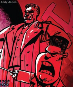
Artwork by Andy Janes
Were there any brick walls you hit during the process, and do you feel as though you were able to overcome them successfully?
Ashley: Page layout…it’s a little bit harder than it initially appears. How do you encourage someone to read one bit fast and another bit slowly? Getting the composition of the panels on the page as well as inside the panels to create an easy flow for the reader to follow. I’m far too used to drawing in the same size box over and over again.
JP: My challenges were mostly in trying to condense a huge swathe of history into twelve pages. I would have loved to explore character a lot more and have a chance to play with dialog. As a story artist used to churning out hundreds of panels, living with the limits of five-to-seven panels on a page is pretty painful too.
Andy: Some of the panels had to be shrunk to fit everything in. It would’ve been nice to have stretched it over more pages, but then I probably wouldn’t have finished.
Michael: Just getting used to the computer really…digital workflow and all that.
Rej: This was my first time doing a comic, and so I had loads to learn and felt quite overwhelmed working in Photoshop. Luckily I had Ash to tutor me, helping me with dialogue bubbles, fonts and just general Photoshop technicalities.
Emilie: I must admit I was terribly nervous about making a comic. It’s always been a dream of mine and when the moment’s finally there you want to make something good, you know? So I guess I struggled with an artist block for a while, but pushed through it when I remembered to just have fun.
Matt: As always I struggled to find a satisfactory ending – I resorted to a cheap false teeth gag to round off the story!
Jay: A brick wall for me was accepting that the comic was going to be a physical object, which, once I did, was very exciting; usually in the world of storyboarding no one ever sees the work once the actual animation has been completed. It was also a very worrying time awaiting the printing delivery as there were a few issues right at the very end, so the delivery deadline kept getting pushed. When you’re waiting for a thousand copies of your drawings to arrive it makes for a very tense few weeks.
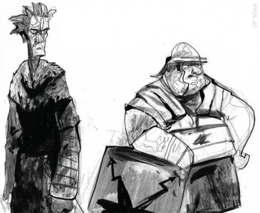
Artwork by Jean-Philippe Vine
Were any of you able to use the opportunity to help strengthen a pre-existing visual style you feel that you’re known for, or was it an excuse to do something completely new and outside of your respective wheelhouses?
Matt: Oh, it was absolutely a chance to experiment – I’ve made comics in the past but never for public consumption, so this was my first opportunity to be published! I wanted to keep the style as rough and loose as possible and hoped working digitally would allow for that. It transpired however that working digitally is still very time consuming as I kept re-working the artwork to find an appealing ‘look’.
Jay: I hope I have a playful style that I was able to bring to the fore in my comic, but the subject matter was much more involved in human emotions and relationships. My day job is usually concerned with slapstick and visual humour.
Emilie: I think it’s important to use a style fitting for the project. As I always challenge myself to try new things, I guess I’m always a bit ‘out of my wheelhouse’. Hopefully there are elements to my work that people recognize (and appreciate) as ‘typical Emilie’. In this case the biggest challenge was the traditional inking.
JP: I had high hopes of traditionally painting the whole damn thing. Ah, well. Photoshop won in the end.
Rej: In comics you don’t necessarily work as cinematically as you would in film storyboards, so it helped me expand my range of storytelling.
Michael: I wanted the style as simple and deadpan as possible, to emphasise the ‘boringness’ of the story.
Ashley: Half the fun of doing stuff like this is to find something slightly off your own personal beaten path. If you keep doing the same thing, yeah…you might do it well, but you aren’t developing and finding out new techniques. Maybe a lot of people get put off by how bad the first attempt looks when you try it; I have lots of bad first attempts…and second and third ones come to think of it. Also, I like to think that the story should also have some bearing on the art direction in that you can put the viewer in a mindset almost immediately. Sepia tones? Well, that won’t scream ‘space age’, will it?
Sarah: As my job consists of designing digitally, when I have the opportunity to do my own design work I tend to opt for hand-drawn illustrations just to try something different. When I was asked to be part of this book I was still quite new to illustrating, I knew the styles that I liked but I hadn’t quite found my own yet, so I think this is why I chose to do a mixture of different type throughout the piece. I found this piece has helped me to illustrate more freely and find a style that suited me.
Andy: I think due to the time constraint I didn’t feel I had too much time to experiment. I’m not sure I’d even attempt something out of my wheelhouse on such a big project, especially my first attempt. Need to first get comfortable in my comic slippers before I start wearing green Lycra shorts – people might stare!
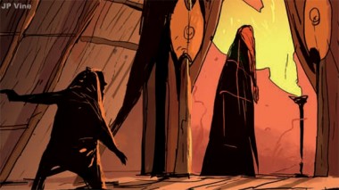
Artwork by Jean-Philippe Vine
Do you feel that working within Aardman is a valuable contributor to your creative process, in the case of this book as well as other endeavours?
Michael: I think it has to be really doesn’t it? A lot of creativity in these rooms…and a lot of love, too..
Emilie: Yes! Being surrounded by such creative people, it’s hard not to be inspired by and learn from them.
Matt: Aardman is a great place to work! They supported my efforts to gather employees for regular life drawing sessions at a local Bristol art school. The studio is full of inspiring creative folk and the love they have for the medium is reflected in the unique output of the studio.
Ashley: It’s very hard not to be influenced by all the people who surround you. Sometimes I’ll take a wander around the studio and see something, like a unit with a new set, all lit and ready for shooting or some new character designs pinned up on the wall and think “Wow”. It definitely has an impact on the creative process. Combine that with the fact that you can turn around if you’re stuck (either with work or personal projects) and are faced with group of people who you trust are 1) Really good at what they do and 2) Aren’t shy about telling you where something could be better…not in a blatant “that’s crap” way…more like “have you tried this, because I can see what you’re doing and this may work better”. In terms of the book, it definitely pushed me on a bit seeing what other people were producing.
Andy: I’m sure working at any animation studio can help hone your artwork – and with deadlines every day, hone your drawing speed! Maybe having a background in the film industry helps with the story side of things as well as the visual.
Rej: I love working with Aardman. Their style of storytelling is very different from most places I have worked. There is an emphasis on subtle acting and dry humour that I love. I’ve learnt loads just being in the creative company of Nick Park and Peter Lord. Hopefully there is an element of Aardman style incorporated in my story.
Jay: Ultimately Aardman’s work is very visual and works on that level first and foremost, so it felt a natural fit to work on a visual comic. My storyboard background also made it an easy transition. You have to try and achieve a lot in one storyboard: the story, good character, clear composition, clear emotion that can brief an animator, I felt a need for all these techniques in the production of my comic. I know I had my filmmaking head on. If I drew a panel that felt like it would be a camera pan, that panel would have to be long and go across the page, forcing the eye to pan along as the camera would do.
JP: It’s certainly good to be part of a team renowned for craft, but to be honest, looking from within the company, it’s often what the bright young things outside the studio are doing that gets me motivated. I’m inspired by French design and flair, American storytelling. I love Aardman, but at some point it has to move beyond the era of “Wallace and Gromit”. The next two features should be an interesting time for the studio!
Artwork by Matt Jones
I’m especially interested in the angle of the book’s contributors all coming from an animation industry background. Did you find that this complemented and/or helped the process, or was it tricky to get acclimated to a different method of visual storytelling?
Ashley: It was definitely tricky getting used to the page. There were some psychological issues in getting my hand to draw outside of the standard 16:9 screen box.
JP: As story artists we only ever draw on one frame size, for the screen; when faced with a blank page where any size or shaped frame can be used was daunting.
Ashley: But once that hurdle was overcome…well, it wasn’t all plain sailing. Only having one panel for the moment forces you to pick the crucial storytelling element. In board I tend to try and “do it in three” as we get the luxury of movement on a screen. As far as things that helped…coming from a film background you have an understanding of “film language”. Although you can get away with breaking the rules in comics a lot more (people have as much time as they want to spend on each page, therefore more time to take in and understand the information) simple things like screen direction and basic camera work really help to keep your audience in “that” moment.
Rej: I definitely thought doing the comic would be easier because I do storyboards, but it was a lot harder than I thought. I needed to self-edit my work much more than I would have working on an animated film. You have to think much more about entire page layout than cinematic cuts in telling your story. You can’t put as much acting or timing in the panels, so you have to think on telling your story more economically, which is always a good thing.
JP: For animators making comics, we all felt that challenge was in dealing with the economy of comics, to select the only right pose or action for that specific story beat.
Andy: I suppose each has its own unique story telling process. Comic books don’t need to run in a linear fashion and you can play around with the image a lot more. So it was tricky not to either get carried away or swamped by the sheer number of options available to tell the story.
Matt: Nah, storyboarding and comic books are closely related – if anything, I wanted to make my strip illustrative but combine some more cinematic compositions and play with the rhythm of the panels.
Michael: Mine has a big storyboard influence being all in square boxes…but that is part of the deadpan feel.
Sarah: Working in the digital department, this was something completely different for me personally. Although we can tell stories through the web and games, this was something that felt more permanent to me, as it was in print and couldn’t be changed! That was quite a scary thought, to have something so final as, although I’ve created personal designs for print before, being in this book was a much bigger deal. This made it harder to know when to stop adding to the design, and when to consider it ‘finished’.
Emilie: I’m Belgian and thus have been brought up in a very rich comic/BD culture. So it’s a kind of storytelling that I’m familiar with. And yes, we do have good beer and waffles too.
Artwork by Ashley Boddy
Was there anything about the experience that made you feel you’ve benefited as an animator/designer/storyteller?
Michael: Erm…yeah. It’s a chance to do your own work, innit?
Emilie: Definitely! All of it! You always learn and broaden your horizons when working on projects like these. Or I do anyway – maybe that will stop when I’ve come a certain age, but I hope not because that’s what I like about my work.
JP: Following on from the previous point, page composition killed me at first, but I felt like I was just starting to get a tiny handle on it by the end of the story! I gained a real respect for artists who have mastered page design. Mignola sits up there at the top of the tree for me.
Matt: It was a constructive exercise to distil an epic story into eight pages and relate the tale without dialogue or colour. Those were the parameters I set myself to work within.
Sarah: The response from the book has been fantastic, so that has definitely given me a mini confidence boost as a designer, and it helped me to understand a little more about how self-publishing a book works. I’ve also benefited from getting to know such talented people I work in the same company for, but may have never crossed paths with as our jobs are so different.
Ashley: It’s forced me to analyse my posing more and be a bit more economical in my boards. Which means I’m getting more done and not drawing so many panels! The plus side of this is I have more time to do comics…I hope my employer isn’t reading this…
Jay: The driving force for my involvement in ‘Spiffing’ is that in the animation industry ideas can often be lost in development hell or picked to pieces by producers or committees. For me it was an opportunity to tell personal stories now and in the future and not have to get someone to buy into it or put up money. Sometimes to succeed, sometimes to fail – but that is the only way to learn to tell stories and get better.
Do any of you have future plans for the characters/stories you created, such as a longer-form story or animated incarnation?
Michael: I haven’t, no. He’s dead to me now.
JP: I have been looking at a long format story for my Romans, but I have suspicions that it’s not going to be funny. And I like things to be funny.
Jay: If I’m to continue producing more from the archive I would hope that about ten volumes down the line someone could look at the project and see the potential in making an animated long form version – along the lines of something like ‘Persepolis’. I’m currently writing and sketching up artwork for volume two. It will consist of more stories from the Waterstein Archive, but will be more ambitious in its scope. The characters have endeared themselves to me and seem to offer a little theatrical troupe that I can hang stories on, so I’ll continue to write for them and hopefully they will endear themselves to readers.
Matt: I’d love to expand mine into a short and exaggerate the sea voyage further; Bert could drift for weeks, months and encounter all sorts of marine beasts, strange islands and hallucinations!
Andy: As a comic story the plan was to leave it with the ending as is. However, you could possibly take Patrick Moore on an adventure to find out what happened to his pal Rocky, but at the moment I’m developing a new story. And an animated Feature, it certainly has the possibility to be turned into another film prospect, which is something to be mulled over. I do like to mull!
“Tales of the Spiffing” is available in print online at Big Cartel (http://spiffingartists.bigcartel.com ) and digitally through Whamix! For iPad (http://www.whamix.com/). As well as those interviewed here, the book also features an introduction by Aardman co-founder Peter Lord, stories illustrated by Michael Cole, Rej Bourdages, Jess Jackson, Kris Pearn, Dave Vinicombe, Theresa Whatley and artwork by Luis Cook, Felix Massie, Sarah Laborde, Jonny Duddle, Laura Büchert Schjødt, Dani Abram and Gavin Strange.
The book will be showcased as part of TR!CKSTER ( http://trickstertrickster.com ) in San Diego at the end of the month.
For more information on the project and to find out where the artists will be appearing to promote it you can visit the website at talesofthespiffing.blogspot.com

